Showing posts with label people'll kill nature. Show all posts

Wednesday, March 16, 2011

Map of the Week-Nuke Plants in Earthquake Zones

The awful events going on in Japan made me curious about where else in the world there are nuclear plants in earthquake zones. Fortunately maptd had the same idea so they did all the work for me. Click the map below to get to their post and link to a google "heat map" of earthquake areas with a nuke plants overlay.


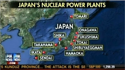
I was not previously familiar with the maptd blog but they have some excellent coverage of the mess in Japan including before and after pictures. They also include this Fox News "map fail" showing Japan's nuclear plants that includes the Shibuya Eggman, a nightclub in Tokyo. The map also missed several plants according to this wikipedia entry.

Friday, May 21, 2010

Map of the Week Oil Slick Update

There is a cool app on the Google Lat Long Blog where you can compare the size of the oil spill to your own corner of the world. That way you get a better sense of how large this disaster really is. People love to compare things to Rhode Island but try and you'll see it's much bigger. In fact it's threatening to swallow New Jersey whole.

Wednesday, May 19, 2010

Map of the Week-Deepwater Drilling and Spilling

The New Orleans Times-Picayune has some very detailed coverage about the BP Deepwater Horizon Oil Spill in the Gulf of Mexico. There are lots of maps and graphics showing how the spill happened, what BP is trying to do to contain it, fishing closures and the extent of the damage. You can also read some fascinating comments. Blame an accident by a British oil company on whatever US politician you don't like. Choose the comments that work for your agenda!

Here is an image from NASA. Not pretty.


Below are forecasts of the extent of the oil slick for today and tomorrow.


They also have a map animation. Click on the image below to see.    


Thursday, January 31, 2008

Map of the Week 110 - Sea Change

Promotional materials for the upcoming 12th edition of the Times Comprehensive Atlas of the World include these maps of the Aral Sea. The first one is from the 1967 edition of this atlas.

The second map from the new edition (2007) shows how much the sea has shrunk since then due to water extraction and climate change. The Russian government diverted the main rivers that feed it (the Amu Darya and Syr Darya) for irrigation. Now Kazakhstan and Uzbekistan have inherited a salty, polluted mess. But there may be oil and gas underneath so all's not lost.

Oh and you're supposed to admire the nice Bartholomew cartography too!