Showing posts with label environment. Show all posts

Wednesday, November 2, 2011

Melting Sea Ice in the Arctic Ocean

Ice in the Arctic Ocean is melting faster than climate models have predicted. A recent article from The Economist looks at the causes. Included is this map comparing average and recent sea ice extents.


The article also links to an animation that shows the opening up of potential new shipping routes - also shown on the map above. Here is a still frame.


Some interesting notes from the article:

Melting ice creates a "feedback loop" where there is more water and less ice. Water absorbs light and heat, while ice reflects it. More water and less ice means more heat is retained.

Melting ice will enable the extraction of more fossil fuel from the area, creating another feedback loop in which more greenhouse gas emissions will be created.

The melting of the ocean ice will do little to raise the sea level, however eventually more ice will melt off of Greenland and other land areas and that will cause a sea level rise.

Wednesday, September 8, 2010

Map of the Week-Maine Expedites Wind Power

I just got back our annual trip to Maine. The trip primarily involves the following steps.
1. throw a tennis ball into the lake
2. watch the dog bring it back
3. repeat
4 - infinity. repeat

Remy taking a rare break


In between throws I got a little reading done. This article about wind energy from the Maine Center for Public Interest Reporting (reprinted in the Lincoln County News) caught my attention because it's largely about a map the state made under poorly documented circumstances. The map shows sites where wind turbines can get "fast track" consideration. Maine passed a law in 2008 designed to get wind projects moving with a goal of generating 2000 megawatts by 2015.

The map in question does not appear to be freely available to the public. Official records from the meetings where the map was drawn also appear to be non-existent. In fact, the whole process seems to be poorly documented and full of questionable connections between politicians and industry insiders. These projects are causing a rift among environmental groups with some of the groups seeing more harm than good. Beyond the usual "NIMBY" concerns about noise, property values and visual blight, there is also the required cutting of forests, installation of transmission lines, modest power output and much of the power and money being funneled out of state.   

The map was approved by the state legislature as a first step in deciding which projects should be built where and does not guarantee approval. While that map is not available, here is a map from the National Resources Council of Maine showing present and possible future wind projects.


Most of these projects are mountain top sites. The term "In Development" seems optimistic as it appears to mean that permits have been submitted, not necessarily approved. The "Under Construction" category is apparently nowhere-but it seems that the state is hoping the next version of this map will have some yellow stars.

Wednesday, September 1, 2010

The Great Green Wall

Eleven sub-Saharan countries in Africa are working together to create a "Great Green Wall" (La Grande Muraille Verte) of vegetation to halt the growing of the Sahara Desert. This will be a 15 km wide strip of various types of vegetation running the continent from Dakar, Senegal to Djibouti. Local and international organizations are working together to design the route and choose the most effective and useful species of vegetation. The wall's designers hope to help farmers and stem the exodus of environmental refugees.


Wednesday, August 25, 2010

Map of the Week-Pakistan Floods

Flooding in Pakistan has affected more than 17 million people and is "the worst natural calamity of its history" according to Prime Minister Yousuf Raza Gilani. In addition to the 1.2 million homes that have been destroyed there are also problems with water borne diseases, sanitation, lack of medical staff and supplies, destruction of agriculture and growing political unrest. See the BBC for sources and details.

The floods have destroyed more than 17,000 sq km (6,600 sq miles) of land and affect a huge percentage of the country.

Comparing this area side by side with a population density map from Wikipedia gives a good picture of the degree to which the population of the country has been affected.


A list of places to donate money or supplies is available at the Pakistani site Chowrangi.

Thursday, August 19, 2010

Confusing Map of the Week-Oil and Much More

Preemptive Media is an organization that lets participants monitor air quality with GPS enabled monitoring devices. However, this post is not about that. This post is about the confusing map they have posted on their web page.

It's an interesting visualization but full of cartographic problems. First of all too much information takes away from the focus on US oil imports. The title and blocks of text at the bottom about gas and coal confuse the reader about what the map actually shows. It's not a map about all fossil fuels, just one. The country sizes are also confusing - is this supposed to be a cartogram? I'm pretty sure it's not. The colors? I guess they're just colors and have no additional meaning. They did get it right in sizing (by width) the connecting pipelines according to the number of barrels a day we import.

Nevertheless this map does show some interesting statistics about where our oil comes from. Canada and Mexico are our top two sources for oil? Ecuador's in the top ten? Who knew? I also like the chart at the lower right showing how we create greenhouse gases.

One solution to the "Fossil Fuel Fix"

Get a zero emissions car and race it around the world! The Zero Emissions Race is sending four teams (Switzerland, Germany, South Korea and Australia) on an "Around the World in 80 Days" race. The vehicles are all electric and the costs of the energy (including transport across two oceans) will be "offset". They left from UN Headquarters in Geneva, Switzerland on Tuesday and two of the vehicles are currently in Mainz, Germany.

For some reason the other two vehicles are nowhere to be found.


Here is the route they will be taking around the world.

Wednesday, August 11, 2010

Hoboken's Corner Cars

Hoboken, New Jersey, the hometown of the overrated Frank Sinatra and way underrated Yo La Tengo has stepped to the forefront of urban transportation policy with the introduction of Corner Cars.  The program is a partnership between the city and Hertz. Like any other densely populated area, the city has a major parking problem. By placing 50 rental cars around the city they hope to remove over 750 cars from the streets. Here is a map showing the location of the first group of cars.


The cars are placed so that 90% of the city's population live within a five minute walk of a car as illustrated by the map below. They have assigned spaces so you know where to find them and where to park when you're finished.


If you choose to use the local bus service instead the city also provides you with a map showing the live bus locations.


Now what's your excuse for keeping your car? You probably don't live in Hoboken, that's what.

Thursday, July 22, 2010

There's Other Kinds of Petroleum in the Ocean Too

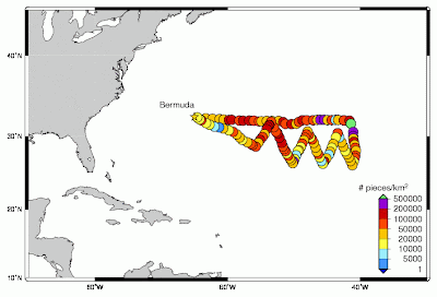
In addition to the oil spills in the Gulf of Mexico and China, there is lots of other petroleum floating around the oceans in the form of plastics. The "Great Pacific Garbage Patch" has made the news but there's lots of stuff floating in the Atlantic as well.

The Sea Education Association (SEA) just concluded a research expedition examining the accumulation of plastic debris in the Atlantic Ocean. With no advocates for the open ocean, SEA hopes that this excursion will raise awareness of the pollution problem.
The expedition sailed 1000 nautical miles east from Bermuda in an attempt to find the eastern end of the concentration of debris. As the map below indicates no edge was found. The ship took readings every 30 nautical miles along a jagged course through an area of converging currents .


The map could certainly be improved. Purple is a lousy choice for the top category-or is that green dot the top category? While there is no obvious pattern here, it is clear that the problem is widespread and comes from all of us. SEA is hoping we all re-evaluate our behaviors to help stop the problem from getting out of hand. The July 13th daily update eloquently states the problem and potential mitigation measures we can all take.

This map of the Pacific from NOAA shows how currents can take garbage from all over the planet and push them into these convergence zones. Note that this map is an oversimplification of ocean currents, as is the term "garbage patch"-see the link for details.

Wednesday, June 30, 2010

Map of the Week-GOOD Volcano Map

GOOD is an online journal that asks the question "what is good right now?" One of the highlights is their "transparency" series of graphics and maps. The latest transparency shows how small the recent Eyjafjallajökull volcanic eruption in Iceland was compared to other historic volcanoes. The disruption to the economy and to air traffic was huge but as the graphic indicates we should expect much worse in the future.


The tall orange triangles on the map are "decade volcanoes." I've never heard that term either but according to the description page it means a volcano "currently noted to have a history of large eruptions and a proximity to populated areas."  In other words if one of those blows it's really going to mess things up.

Friday, May 21, 2010

Map of the Week Oil Slick Update

There is a cool app on the Google Lat Long Blog where you can compare the size of the oil spill to your own corner of the world. That way you get a better sense of how large this disaster really is. People love to compare things to Rhode Island but try and you'll see it's much bigger. In fact it's threatening to swallow New Jersey whole.

Wednesday, May 19, 2010

Map of the Week-Deepwater Drilling and Spilling

The New Orleans Times-Picayune has some very detailed coverage about the BP Deepwater Horizon Oil Spill in the Gulf of Mexico. There are lots of maps and graphics showing how the spill happened, what BP is trying to do to contain it, fishing closures and the extent of the damage. You can also read some fascinating comments. Blame an accident by a British oil company on whatever US politician you don't like. Choose the comments that work for your agenda!

Here is an image from NASA. Not pretty.


Below are forecasts of the extent of the oil slick for today and tomorrow.


They also have a map animation. Click on the image below to see.    


Wednesday, March 24, 2010

Map of the Week-Replumbing California

The April issue of National Geographic is devoted to water, specifically the growing scarcity of fresh water. Articles cover ways to acquire, conserve and protect fresh water, our changing climate and conflicts over water, from the local to the international level. There are various maps, including a fold out worldwide "mapping of every river system." Online content includes this interactive map of California's water system. The online map is synchronized to a legend that shows the length and volume of the man-made water conduits that bring water west and south toward the Central Valley and large cities.

The article discusses the need to reduce the state's reliance on the Sacramento-San Joaquin Delta as a fresh water supply given that area's potential for salt water contamination and earthquakes. Without significant new conservation measures and better ways to transport water, the cities and farms of California will revert to the arid landscape that it was before these water projects were built.

Wednesday, April 29, 2009

Re-Imagining Cleveland

Cleveland, like many northeastern US cities, has been experiencing a steady population decline for decades. The estimated 2007 population is less than half of its 1950 population. An excellent article from the Planning Commissioners Journal highlights some interesting ideas the city's planners have for some of the empty spaces. These ideas include farms, community gardens, and restored wetlands among new commercial and residential districts. Kent State University's Cleveland Urban Design Collaborative (CUDC) has a great report entitled "Re-Imagining a More Sustainable Cleveland" that details many of these ideas. The report can be downloaded from their site, however it is a large file. There are lots of maps that if overlaid can be used to determine the best sites for the above uses. For example, here are maps of foreclosures and vacant land.


The map below on the left shows population loss in blue while the map on the right is the county's proposed"Greenprint."


The report has a nice overlay map showing different soil types to distinguish areas that are more suited to agriculture vs. areas that are better for wetland restoration. These are overlaid on top of existing parks and vacant areas (in dark brown).


Other useful overlays for these purposes are brownfields, estimated population trends and impervious surfaces. Some of these maps are from the Green City Blue Lake website while others are from the CUDC report. Below is a design concept from the report for land in areas around stream headwaters.

Population loss can be a tough pill for a city to swallow but if these ideas are carried out it could turn Cleveland into a model of a desirable urban community.

Thursday, July 10, 2008

Map of the Week-What is and How is Cascadia?

Attention residents of Cascadia (outlined in green on the map on the right): Sightline, a Seattle based think tank has a slew of maps showing health, environmental and economic data for your region. There are some nice animations but they don't come over well on this page so here are some static maps. On the left is the Seattle area classified by walkability and on the right is a map with pie charts showing the decline of Salmon stock in the region. For lots of other interesting maps of the region, visit their maps page.

Thursday, January 31, 2008

Map of the Week 110 - Sea Change

Promotional materials for the upcoming 12th edition of the Times Comprehensive Atlas of the World include these maps of the Aral Sea. The first one is from the 1967 edition of this atlas.

The second map from the new edition (2007) shows how much the sea has shrunk since then due to water extraction and climate change. The Russian government diverted the main rivers that feed it (the Amu Darya and Syr Darya) for irrigation. Now Kazakhstan and Uzbekistan have inherited a salty, polluted mess. But there may be oil and gas underneath so all's not lost.

Oh and you're supposed to admire the nice Bartholomew cartography too!

Thursday, January 17, 2008

Map of the Week 108-Got Biomass?

OK - I couldn't resist the dopey cliche of stealing from milk commercials - everyone else is doing it!
The National Renewable Energy Lab in Golden, Colorado is working on an atlas of renewable resources for the USA. They have put together a bunch of maps showing potential development of Solar, Wind, Hydrogen, Biomass and Hydrogen as energy sources. Their color choices are a bit confusing but the patterns are clear enough. Here's a biomass map with their description below:

"These maps estimate the technical biomass resources available in the United States by county. Biomass feedstock data are analyzed both statistically and graphically utilizing geographic information systems (GIS). The following feedstock categories are considered for this study: crop residues, methane emissions from manure management, methane emissions from landfills and wastewater treatment facilities, forest residues, primary and secondary mill residues, urban wood waste, and dedicated energy crops."

Of course when you normalize it by population the results are slightly different - especially down in the Southwest where they suprsize their counties:

Wednesday, October 31, 2007

Map of the Week #98 - The Vermont Foliage Cookie

My wife bought a Vermont shaped cookie cutter and as we were making Halloween cookies last night I tried to color mine along the lines of the foliage maps that we had seen in the newspapers up there a few weeks ago. While it did not match the state's tourism web site animation very well, it did come somewhat close to the September 25th foliage map on the bottom right. In fact it was close enough that Amy was able to guess what the map was showing on the first try.


Thursday, October 25, 2007

Map of the Week #97 - California Burning

The US Forest Service has a web site that monitors major fires. Usually they are spread throughout the country but this week it's all happening in southern California. You can click on the dots on the map and get a status report for any fire. You can also link from this site to Google Earth and get a close up view of all the fire activity going on throughout North America. The image to the right from Google Earth shows the current fire activity in southern California.

Friday, September 14, 2007

MOTW #91 - Lake Tahoe Fire Risks

The Sacramento Bee had an article this past summer with a nice map illustrating how much building is going on in high risk areas for forest fires. The red are areas of high fire risk and the black dots represent building permit locations.

Thursday, August 9, 2007

MOTW #87

These maps are "wind speed grids" for New England. The heights (30m, etc) in the upper corners are the height at which the wind speeds were measured. This study was done by Truewind Solutions to get an idea of how much wind power can be derived from wind turbines of different heights and locations.
If you really want the whole in depth analysis you can go to the Mass. Technology Collaborative and get a detailed wind map for areas within souther New England.