Showing posts with label international. Show all posts

Wednesday, September 21, 2011

Map of the Week - Wear a Helmet!

NASA's defunct Upper Atmosphere Research Satellite is expected to fall back to earth on Friday, give or take a day. They don't know where but based on the satellite's orbit they've narrowed it down to somewhere between 57 degrees north and 57 degrees south latitude, in other words somewhere between northern Canada and the southern tip of South America - where just about everyone lives. The dark areas on the map below could get hit with debris.


If you're in Antarctica, you have nothing to fear, except for the fact that your continent has gotten huge on this map projection. For the rest of us there's a 1 in 3,200 that someone in this zone will get hit. The U.S. Strategic Command at Vandenberg Air Force Base will provide updates as the time gets closer. In the meantime watch for falling objects.


Friday, August 12, 2011

Weekend World Map of Condiments

It's another weekend - so enjoy your local condiment. This map is from Jeff Wysaski's Pleated Jeans site. South Salsa?


Wednesday, July 6, 2011

Animated Map of Wikipedia Edits

Wikimedia Statistics produced this animated map showing edits to Wikipedia by language and location on what they refer to as a "typical day" - May 10th 2011. The animation starts at 12:15 GMT, giving it a European bias but you can move the clock ahead. I don't see an option to move the clock backwards to see more of what happens in Asia. Here is a screen shot. You can click on it to get to the animation but it may not work in some browsers.


You can also choose bubble maps or heat maps and see the distribution of edits in various languages. The background can change if you like to be distracted by gratuitous topography. I prefer the dark background. This colorful map shows the most edited language in each area.

Thursday, June 9, 2011

Infographic of the Week-Learn a New Language

From the Daily Infographic, this is not exactly a map but interesting. These languages are considered easy, medium or hard to learn for native English speakers. The data is from "learning expectations" compiled by the Foreign Service Institute of the U.S. Department of State. This makes me wonder how English would do for someone from any of these other places.
I spent years studying French and I can still barely speak it. If the graphic falls off the page a bit that's just Blogger being Blogger. You can click on it for a full size view.


Wednesday, March 9, 2011

Map of the Week-Fake Countries!

Micronations are small areas with (generally unrecognized) claims as sovereign states. They tend to be left or right wing attempts at secession, tax evasion schemes, jokes or publicity stunts. There is a micronation wiki on wikia, with a list and descriptions. Some are amusing while others are somewhat disturbing and the level of seriousness is not always clear.

The microfreedom page has descriptions, flags, links to websites and this map. There is also helpful information and warnings for anyone interested in starting their own country.


Here is a detailed view of some of the micronations of North America. The map and country lists do not completely agree.


I have not carefully researched the details of each county but the republic of Molossia has a good website with some interesting details about it's wars with Mustachistan and East Germany.

As this map shows, Mustachistan has made some pretty bold land claims so you can't really blame Molossia for challenging them.

Below are maps of the Battles of Lake Jean and Rattlesnake Rift during the War with Mustachistan. Why two Nevada area republics fought a battle (Lake Jean) in a Pennsylvania State Park is a long story but if you really want all the details follow the links above.


Wednesday, December 29, 2010

Google Zeitgeist-the most popular searches of 2010

Google Zeitgeist reviews the most popular search terms of 2010. You can pick a country and see the most popular searches by month and the most searched personalities (some muppet named Justin Bieber tops most of the lists.) For the United States you can choose a city and see the most popular searches (university web mail servers are huge.)
Of course the best part is the interactive map.


You see how frequently some of the major stories of the year were queried by month with bar charts for each country. You can also play an animation for the entire year and compare up to three stories.

Also, you can choose a subject or person and get a map showing interest by state. Here is the Justin Bieber popularity map. Pardon the hideous plate carree (or something similar) projection. Happy New Year Justin-Virginia loves you!

Thursday, August 19, 2010

Confusing Map of the Week-Oil and Much More

Preemptive Media is an organization that lets participants monitor air quality with GPS enabled monitoring devices. However, this post is not about that. This post is about the confusing map they have posted on their web page.

It's an interesting visualization but full of cartographic problems. First of all too much information takes away from the focus on US oil imports. The title and blocks of text at the bottom about gas and coal confuse the reader about what the map actually shows. It's not a map about all fossil fuels, just one. The country sizes are also confusing - is this supposed to be a cartogram? I'm pretty sure it's not. The colors? I guess they're just colors and have no additional meaning. They did get it right in sizing (by width) the connecting pipelines according to the number of barrels a day we import.

Nevertheless this map does show some interesting statistics about where our oil comes from. Canada and Mexico are our top two sources for oil? Ecuador's in the top ten? Who knew? I also like the chart at the lower right showing how we create greenhouse gases.

One solution to the "Fossil Fuel Fix"

Get a zero emissions car and race it around the world! The Zero Emissions Race is sending four teams (Switzerland, Germany, South Korea and Australia) on an "Around the World in 80 Days" race. The vehicles are all electric and the costs of the energy (including transport across two oceans) will be "offset". They left from UN Headquarters in Geneva, Switzerland on Tuesday and two of the vehicles are currently in Mainz, Germany.

For some reason the other two vehicles are nowhere to be found.


Here is the route they will be taking around the world.

Thursday, July 22, 2010

There's Other Kinds of Petroleum in the Ocean Too

In addition to the oil spills in the Gulf of Mexico and China, there is lots of other petroleum floating around the oceans in the form of plastics. The "Great Pacific Garbage Patch" has made the news but there's lots of stuff floating in the Atlantic as well.

The Sea Education Association (SEA) just concluded a research expedition examining the accumulation of plastic debris in the Atlantic Ocean. With no advocates for the open ocean, SEA hopes that this excursion will raise awareness of the pollution problem.
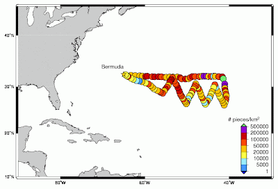
The expedition sailed 1000 nautical miles east from Bermuda in an attempt to find the eastern end of the concentration of debris. As the map below indicates no edge was found. The ship took readings every 30 nautical miles along a jagged course through an area of converging currents .


The map could certainly be improved. Purple is a lousy choice for the top category-or is that green dot the top category? While there is no obvious pattern here, it is clear that the problem is widespread and comes from all of us. SEA is hoping we all re-evaluate our behaviors to help stop the problem from getting out of hand. The July 13th daily update eloquently states the problem and potential mitigation measures we can all take.

This map of the Pacific from NOAA shows how currents can take garbage from all over the planet and push them into these convergence zones. Note that this map is an oversimplification of ocean currents, as is the term "garbage patch"-see the link for details.

Wednesday, July 7, 2010

Map of the Week-Worlds of Fun

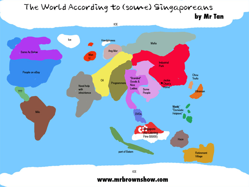
These world maps have been all over the internet for years. They are often full of racism and ignorant cliches but they can also be fun. Here are some samples for your reading pleasure.

There's your standard "world according to Americans" series.


Martin from vwMaps just sent me this one - source unknown.


Here is a map about U.S. geographic illiteracy from a term paper writing site. The article that accompanies the map uses some remarkably bad grammar to complain about illiteracy.


Had enough of the American perspective? How about Taiwan?


Finland?

 One last one: Singapore:


And finally, a cow's spotty world

Wednesday, June 30, 2010

Map of the Week-GOOD Volcano Map

GOOD is an online journal that asks the question "what is good right now?" One of the highlights is their "transparency" series of graphics and maps. The latest transparency shows how small the recent Eyjafjallajökull volcanic eruption in Iceland was compared to other historic volcanoes. The disruption to the economy and to air traffic was huge but as the graphic indicates we should expect much worse in the future.


The tall orange triangles on the map are "decade volcanoes." I've never heard that term either but according to the description page it means a volcano "currently noted to have a history of large eruptions and a proximity to populated areas."  In other words if one of those blows it's really going to mess things up.

Thursday, June 24, 2010

Map of the Week-The $5.5 Million Fence

The G20 summit is coming to Toronto this weekend and you are NOT invited! They are building a security fence in your honor at an estimated cost of $5.5 Million according to the Globe and Mail. The fence is outlined in red on the map below. The lighter shaded area is where automobile traffic will be tightly controlled.


This area is right in the middle of downtown and encompasses many theaters, hotels, restaurants, sports venues and other attractions such as the CN Tower. Most of these places will be closed and the Toronto Blue Jays will be playing their "home" games this weekend in Philadelphia. That means the area's 25 or so baseball fans will miss Roy Halladay's big return to Toronto.

The Globe and Mail has an interactive map showing the security and closures. The items on the left side of the map can be clicked for locations and more information.


 Also, if you are in or near the area be prepared to look good because you will be photographed as illustrated by this security camera map from the Toronto Star.

Wednesday, June 16, 2010

Map of the Week-The Atlas of True Names

I missed the Atlas of True Names when it first came out almost two years ago but they now have an iPhone app so that gives me an excuse to talk about it. The Atlas takes the etymology of place names and translates their original meaning into modern English. London becomes "Unfordable River Town", San Francisco is "Saint Little Frank One", etc. Here is an iPhone screen shot of southern Africa.


 When you click on a country, it gives you some etymology.


Unfortunately, the Land of the People with Tall Caps did not make the iPhone map. This is from the world map detail on their web page. The area looks identical on the phone except for no people with tall caps. I want my money back!


 There are some additional search and bookmark functions but that's mainly what you get for your $3.99. The World Map is nice but you don't get the level of detail that you get from some of the regional maps like their online example below. Hopefully that will be a future enhancement.


Thursday, May 27, 2010

Map of the Week - Worldwide Number Ones

David McCandless is a London based author and designer. His Information is Beautiful site put up this map showing a selected superlative for most of the world's countries. The stats are from various sources including the CIA World Factbook, the UN and Wikipedia. Click the map for a readable version.


Wednesday, December 30, 2009

Map of the Decade!

With grandiose visions of making a "Map of the Decade" I went and sought out some lists of the top news stories from the internet. Trying to find lists that were not biased by politics, region, or sector (such as technology) was impossible. The best I've come up with is this list from about.com. The list is biased towards the USA and our strategic interests and I have my own disagreements, notably the absence of China (big earthquake, rise as a superpower, hosting the Olympics) but I decided to map their list anyway.

Due to the limitations of the Blogger template you'll need to click on the map to see a readable version.


The background map is from MapQuest because they have the least annoying worldwide projection of the major mapping sites. I used the images from the about.com list though some of them are not very recognizable. I placed them at or near the approximate locations of each story except the global recession. That one got put on the Equator.

Yes the inclusion of Michael Jackson is ridiculous. Tell me something I don't already know! Like for example, what should be on this list instead. Have a happy new decade!

Thursday, December 24, 2009

NORAD Tracks Santa

Santa has begun his difficult journey delivering presents to the good boys and girls of a certain religion. You can follow his progress on Google Maps. Check soon before he takes his well deserved post-holiday break.


He's in Brisbane! Wait, now he's in Alice Springs! He's one fast fat guy!


Wednesday, December 9, 2009

Map of the Week- Global Warming

It's snowing here in the northeastern USA so clearly global warming is a hoax! While climate change skeptics and their corporate sponsors continue to bury their heads in the sand, real scientists are gathered in Copenhagen for the United Nations Framework Convention on Climate Change. One of the primary goals is to try and limit the rise in temperatures. Britain's Met Office warned of a possible 4 degree Celsius rise in temperatures by 2060 in a study produced for the Department of Energy and Climate Change. The British government has produced an interactive map showing the impact of a 4C rise in global temperatures.


The circles represent hotspots for the categories listed at the bottom and can be turned on and off as well as clicked for more info.


Down at the bottom is a "credits" tab if you wish to investigate the data sources more closely.

Wednesday, August 26, 2009

Map of the Week - The Yard Sale Bonanza!

Our neighbors had a yard sale recently and I picked up a pile of maps for $2! Later on when they left the rest on the curb, my wife picked up another huge pile for nothing! Here are some of the spoils:

Grenada tourism map produced by the Ordnance Survey (U.K.)


Old City detail from"Nice et Agglomeration" by Plans-Guides Blay, Paris.


KLM/Shell map of Ghana - produced by the Survey of Ghana, Accra.


Berndtson & Berndtson (B&B) Map of Costa Rica (laminated!)


Detail of
San Jose
from the
B&B map.


"Pianta di Venezia" - Free tourist map.

Wednesday, June 24, 2009

Chart of the Week-Mind the Gap!

Hans Rosling is a professor of global health at Sweden’s Karolinska Institute. He creates animated charts in an attempt to counter myths about the "developing world." Very basic shapes and colors make the patterns clear. Here is an example of his work, a chart showing child mortality vs. income for the countries of the world. The dots are sized by population and colored by region. Note the compass rose too.


However it gets more interesting to see these charts in action as they appear in his gapminder web site - the name inspired by London's Underground. While the chart above shows much of Asia and Africa lagging behind, the animations show the "developing world" catching up and improving at a quicker rate than much of the West did. Here is are some frames of a 200 year time sequence showing life expectancy vs. income. Click the frames to get the web page. You can also choose countries to highlight and hover over a point to get the country name.


If you have time and a decent internet connection, watch this video. He is entertaining and it may change the way you look at the world.

Wednesday, June 17, 2009

Today's Weather Forecast-Sunny in the Deserts, Rainy in the Rainforests

I was looking something up on CNN when I came across these weather maps. What's remarkable (or not) is how well they seem to conform to the climate zone patterns of the world. I poorly stitched together the southern hemisphere continents minus Australia (too hard to deal with the scale difference there). I had to rotate Asia for projection issues. Anyway here's a comparison.


CNN's weather forecast for the southern hemisphere.

World Precipitation from Encarta.