Showing posts with label sports. Show all posts

Friday, March 16, 2012

March Madness Redux

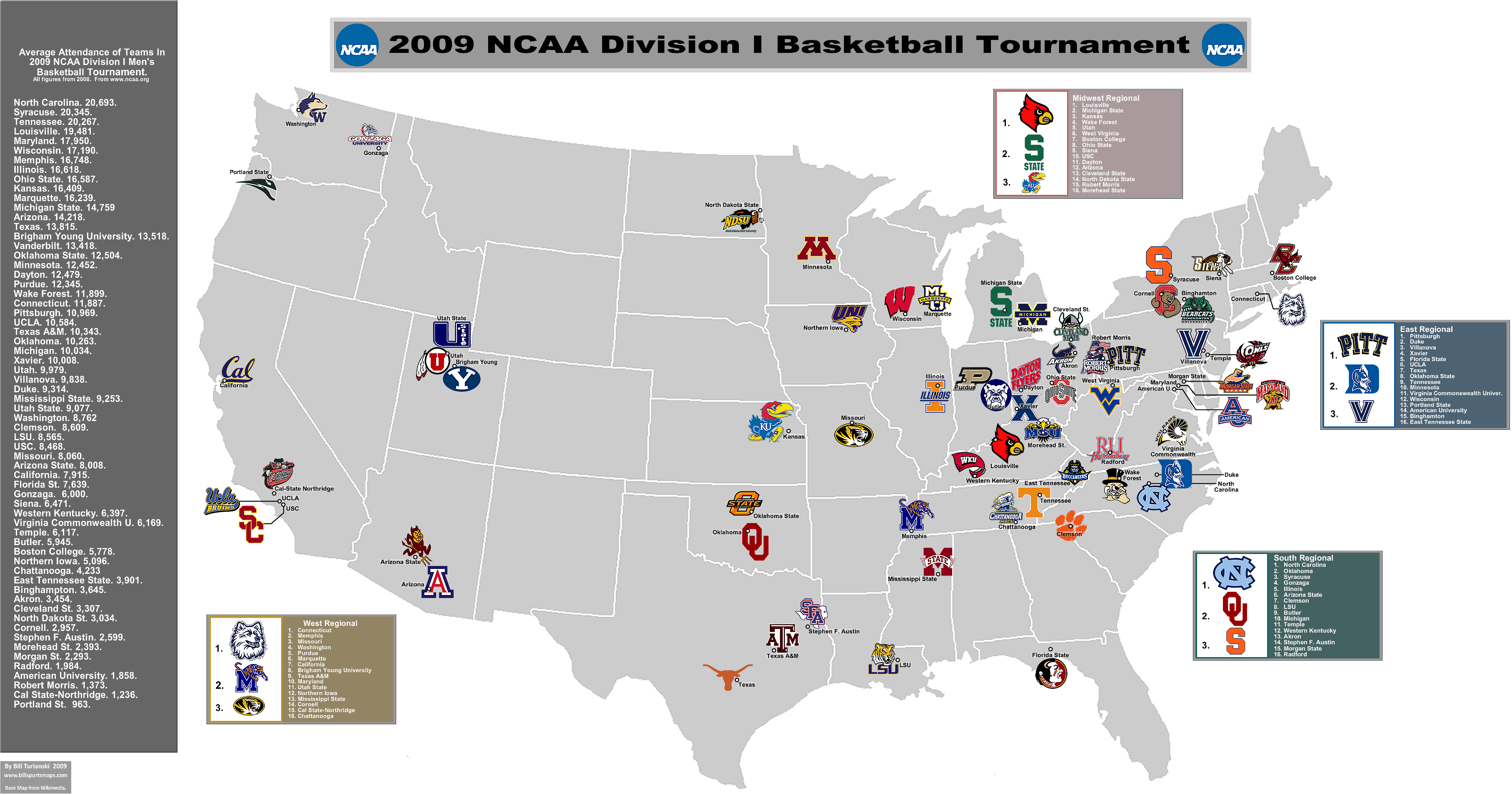
I've had a few inquiries about mapping the NCAA tournament. Bill's Sports Maps is still the best resource for figuring out where the heck Murray State is. Here's a piece of his big map. Click for the full page.


I'd love to give the women equal time but Bill didn't make a map of their tournament and I can't find one elsewhere. With Bill out on injured reserve it's unlikely we'll see one. Maybe if I strategically wait until the final four I can find the time to make my own. Go Great Danes!

Friday, September 24, 2010

Map of the Weekend-ABC decides your region

Every week someone at ABC or ESPN or some parent company decides what college football game you want to watch based on what region they think you're in. This week they feel that those of us in the Northeast would rather watch #7 Texas than #2 Ohio State.
Maybe the Texas game will be less lopsided but they didn't consider how the distance factor can water down the hatred. Texas? Meh. But Ohio State-now you're talking hatred! At least to those of us from Pennsylvania. Go Eastern Michigan!


For those of you who want the NFL product, the 506 has your map:


Seems a bit incorrect to show both the early and late games on the same map but then what do I know about football?

Or you could go outside and enjoy the nice fall weather!

Wednesday, June 9, 2010

Map of the Week-World Cup 2010

The 2010 World Cup in South Africa begins in 32 hours. Of course you will need some good maps to get you to the stadiums. Here is what I have been able to dig up. First, the official map from FIFA, it's kind of dull but you can click each city and get some basic information and a touristy picture for each place.


The 2010 World Cup in South Africa site has a prettier map with stadium pictures but what do those colors mean? Topography? Not exactly. Do the colors add anything useful to the map? Not exactly.


At the more local level Map Studio has some excellent area maps showing the stadiums and nearby points of interest available on the Mappery site. Mappery has a nice interactive interface for browsing through their offerings.


Here are maps of Soccer City in Johannesburg and Moses Mabhita Stadium in Durban.


Wednesday, April 21, 2010

Map of the Week-Baseball Week 3

I could be highlighting a map video of volcanic ash clouds but instead we're going to talk about something really important -baseball! In Japan! I have one more post to honor the start of the baseball season. Bills Sports Maps did a very nice map showing the location of and attendance for Japan's Nippon Professional Baseball league teams.


The hats are sized proportionally to 2009 attendance figures. There's some nice detail when you zoom in. The topography is a bit extraneous but makes for a pretty map.


Some facts about Japanese Baseball (many are from Bill's Sports Maps.)

There are two leagues, the Central and Pacific. They do not appear to be arranged by location. The winner of each league plays each other in the Nippon (Japan) Series.

The Pacific League uses designated hitters while the Central League does not.

Teams are often named for corporations rather than, or in addition to cities or regions. So a team such as the Hokkaido Nippon Ham Fighters are named for Nippon Ham. Not a group that fights their enemies with (or over) pieces of ham.

There is a much larger range of attendance among teams than in the U.S. Attendance figures for the lower drawing teams may be artificially inflated.

The Hiroshima Toyo Carp have seen a 34% increase in attendance after moving into their brand new Mazda Zoom-Zoom Stadium. They appear to be wearing recycled Cincinnati Reds hats.

The Hanshin Tigers had the highest attendance figures in 2009 despite their 4th place finish and history of disappointing seasons.

Wednesday, April 7, 2010

Map of the Week-Baseball Week 1

Here in the US of A the baseball season has begun! To honor the occasion I have a couple of baseball related posts. The indiemaps blog maps out where balls were hit. The first one is of a perfect game pitched by Mark Buehrle of the Chicago White Sox on July 23rd, 2009. The small blue dots are hits and the pink ones are outs. Click on the image to get to an interactive google map of US Cellular Field in Chicago where you can click each point for more information. Highlighted is a 9th inning home run saving catch over the wall that helped preserve the perfect game.


The blog entry discusses the details of how the maps are created using these diagrams from MLB Gameday. The points were converted from pixels to geographic coordinates. The diagram locations are based on observation and may not be as accurate as what you might pay to get from for-profit firms.


The next map, from a Phillies-Pirates game played at Citizen's Bank Park in Philadelphia, shows how different ballpark dimensions can affect the outcome of a game. The hit locations are shown (map on left) then transferred to PNC Park in Pittsburgh (map on right) to show how some of the home runs would have stayed in the park in PNC's larger outfield. Note that differing stadium orientations necessitate rotating the coordinates.


The entry continues with a long discussion about how to transfer the data and a link to the code on github in case you want to try plotting your own favorite game. Good luck! Go Phils!

Wednesday, February 17, 2010

Map of the Week-The Olympics GeoView

I love the Olympics. Especially the Winter Games. However, the Official Vancouver 2010 site seems to lack a basic map showing the various event locations. Each venue has a diagram and map of the immediate area but there's nothing that shows the whole picture*. For example, where is Cypress Mountain? Is it on the way to Whistler? These are the kind of questions that maybe only I care about.
*Note: it turns out there are some better maps - see update at the end of this post

There is an interactive map but when you click it you get this googly mess:

It's way too busy (until you use the filters) and you have to click each site to get the name. Also when you click a site it changes your view to accommodate the large block of googleized text.

OK - enough complaining. What they do have that is interesting is the GeoView. This is an interactive world map showing the countries by medal count, events and number of athletes with various filters. So for example you can see the number of ski jumpers per country or the total number of female athletes in the 1984 Olympics. Here are the countries by total number of athletes at the 1924 Winter Olympics in Chamonix, France.


This is the same map for the 2010 Olympics.


I also like the cute sustainability diagrams. Here is one for Whistler Creekside. An explanation is here.


And of course who can't resist the Google Earth views with building models?


Or the Google street views?


Finally, here is the current medal count (subject to change at any minute).


 **********************************************
Update (Feb 25th) :

There are some decent maps after all. I'd like to think they made these available because I complained, but probably they've been up on the site all along. They're just difficult to find. You have to go to the Transportation section of the site. These are large Acrobat .pdf files that may take some time to download. Here are the thumbnail images.


Wednesday, January 27, 2010

Map of the Week-Take the Long Way Home

Today is Day 90 of the Vancouver 2010 Olympic Torch Relay. It's a long way from Victoria to Vancouver. You could just take the ferry but that's no fun! This route takes 106 days and goes through every province, territory and major city in Canada.


The Vancouver 2010 Olympic web site has an interactive map where you can see the route details and link to events, photos and stories. The route looks more like a child's connect the dots drawing than a map but cartographic accuracy is not their first priority. Here is today's route through British Columbia from Revelstoke to Salmon Arm and then on to Kamloops.


Clicking the red dot at Kamloops brings up a detailed map showing this evening's route and festivities. The detailed maps also feature cartographic accuracy!


Wednesday, March 18, 2009

Map of the Week - March Madness Map

It's tournament time again in college basketball. billsportsmaps has a pretty nice map of this year's entrants. If you want to relive last year's Jayhawk glory you can find maps from the March, 2008 archive. It's nice to see places like Binghamton and North Dakota State on here. Mainly I just like the logos.


May your favorite team bring you happiness!

Wednesday, August 6, 2008

Map of the Week - Beijing Olympic Venues

Friday is 8/8/08 and 8 being a very lucky number to the Chinese it will be the starting date for the Beijing Olympics. The Beijing 2008 website has this nice interactive map, showing the location of the venues. You can mouse over the dots to get basic information and a click on them will get pictures, diagrams, architectural drawings, links to schedules, game rules and much more. What's lacking is a mileage scale so it's not clear how close these places are to each other. Also some transit and/or parking/driving tips would be helpful. You can find that information in the "Spectator Guide"s but they could have put it in a more obvious place.
Hope your favorite country proves their athletic prowess to the world!

Thursday, May 22, 2008

Map of the Week 126-The Olympic Torch Relay

The Beijing Olympic Organizing Committee has put together a nice interactive map of the torch relay route.
You can click on any city on the map and get some pictures (like this one from Wuzhishan in Hainan) and some other basic cultural and demographic information.
Clicking China gets you details from each province. If you want to follow the torch or go protest the government's treatment of Falun Gong, Tibetans or Chinese here's how you know where to go.
As of this post they are either in Suzhou or on their way to Nantong, just north of Shanghai. So light the passion and share the dream!

Thursday, March 20, 2008

Schmap of the Week

Schmap is a Widget you can add to your website to post info about your team, band, city, or other interests. Better to show then tell.


Below you can see the latest exploits of my favorite pathetic hockey team - the Flyers. Click a puck and see how they did in that location - you can also look at the arena - this works better in baseball when you're not looking at roofs. If you don't like them, which you probably don't, you can change the team or even the sport by clicking the buttons up top. Above, for a more international perspective is everyone's favorite French league team Paris St Germain.


You can also put up a city tourist guide - I picked Baltimore in honor of the Baltimore Festival of Maps.


Or you can follow your favorite musician such as Avril Lavigne - well she's not really my favorite but I sure like that heart-bone logo.

Thursday, January 4, 2007

MOTW #59

This map was originally published for the Philadelphia Daily News to show off our awful luck in the realm of professional sports. The map shows cities with their number of championships won since July, 1983, right after the Sixers won our last major sports title. The original map was interactive and you could get the teams that won by clicking on each city, however this map has been taken off their web site.
As many readers have pointed out we are not the only city crying in our beer.

Thursday, February 16, 2006

MOTW #17

I made this map showing where the US Athletes in 2006 Winter Olympics came from.