Showing posts with label USA. Show all posts

Friday, March 16, 2012

March Madness Redux

I've had a few inquiries about mapping the NCAA tournament. Bill's Sports Maps is still the best resource for figuring out where the heck Murray State is. Here's a piece of his big map. Click for the full page.


I'd love to give the women equal time but Bill didn't make a map of their tournament and I can't find one elsewhere. With Bill out on injured reserve it's unlikely we'll see one. Maybe if I strategically wait until the final four I can find the time to make my own. Go Great Danes!

Wednesday, February 29, 2012

Super Commuting

A new report from NYU's Rudin Center for Transportation Policy and Management details the rise of the "super commuter" - someone who commutes from one metropolitan area to another. The report is summarized in an article in the Atlantic Cities. This map shows "non-local labor sheds" for major U. S. cities.

The stars are the commuting destinations while the graduated circles represent the home areas of commuters from outside the region. I like the gratuitous inclusion of Puerto Rico at the bottom right of these maps.

According to the study, these commuters tend to be younger people with modest incomes and may be making these commutes to take advantage of more affordable housing. Many of them probably don't need to show up in the office more than a couple of times a week. Two of the top super commutes are Houston to Dallas and Dallas to Houston. Sounds like a recipe for a house swap reality show.

I grabbed this image directly from the report as a typical detail of one of these areas - in this case Chicago.


 The darker reds represent larger percentage increases. While Detroit had the largest percentage increase, it is still coming from a much smaller number of actual commuters,. Cities such as Champaign and Saint Louis had higher absolute increases. I don't know why Milwaukee is so much smaller than the other cities when it is so close by - better job market there?

Wednesday, February 15, 2012

The Pennsylvania Underground Railroad

To honor black history month, I went digging for maps. While the Underground Railroad is only a piece of that history, it has some of the most interesting map content. I came across this nice map of Underground Railroad sites around Kennett Square in Chester County, Pennsylvania. Quakers from the area were active in the abolitionist movement. The map is from the Kennett Square Underground Railroad Center.


A large print of the map is available here. Below is a detail:


I also found this schematic of the area from the website of Singing Wid a Sword in Ma Han  - a musical docudrama of the Underground Railroad in Pennsylvania playing in New York City.


For a complete picture of the Railroad's breadth, here is a map from Slavery in America.


Wednesday, December 28, 2011

The Frosted States of America

My wife is obsessed with cookie cutters. We travel places and get them as souvenirs. A few years ago I decorated a cookie as a Vermont Foliage Map. Our friend's son Ezra just one upped me with this rendering of the entire lower 48 on a remarkably small US shaped cookie.


He even followed the rule about no same colored states touching-except for a last minute blunder at Vermont. You can nitpick about other geographical details but I doubt you can do better. Nice job Ezra!

Wednesday, November 30, 2011

American Migration

Forbes has a very nice interactive map showing migration within the USA. Click on any county and you can see where people are coming from (in blue) and where they are leaving for (in red.) Hover over a county to get the specific numbers. Clicking the year under the bar chart will give you the figures from that year.


Data is from the IRS and a more detailed description can be found here. You can see the effects of the housing bubble when comparing 2005 to 2009 in certain cities, especially Las Vegas which went from mostly blue to an almost even split. The per capita income figures are also shown for each county. This shows that many cities and other areas are exporting wealth and importing poverty. Click the map above and explore.

Wednesday, July 27, 2011

Map of the Week - Netflix

I was going to post something more intellectual than this but today's a busy one so here's something nice and dumb- a map of what Netflix considers to be popular in your state courtesy of Slacktory.


Wednesday, June 22, 2011

Find Yourself a City to Live In

Sunshine Superboy posted this map on his awesome Black Maps blog. I'd say more but the map speaks for itself. Click to make it readable Link to original post.


Wednesday, June 1, 2011

Quebec's Longest Highway

Quebec Route 366, according to Wikipedia is "a secondary highway in the Outaouais region of Quebec. It runs from Route 301 near Creemorne in the Pontiac to Route 148 in the city of Gatineau."

 
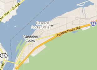
Quebec Route 366, according to Google runs from Atlantic City, New Jersey to Astoria, Oregon-aka U.S. Route 30. Here it is at the beginning and near the end.


The street view from Atlantic City


Why did this happen? I have no idea and nobody seems to have an answer on the google maps help forum.

I first discovered this issue when looking for something in the Exton-Downingtown suburbitopia.


Soon I discovered that they renamed the Benjamin Franklin Bridge.


Much of the legendary Lincoln Highway is now Quebec Route 366. This page from the Pittsburgh Tribune-Review even lists a restaurant in Ligonier, Pennsylvania as being on Quebec Route 366.

Here are more views of scenic Quebec 366 as it travels across the USA.

Over and around Fort Wayne, Indiana


On the edge of Cedar Rapids, Iowa


Heading into Cheyenne, Wyoming


Pocatello, Idaho out by the airport.


Cascade Locks, Oregon

Portland, the City of Roses.


I don't know why Google has been so slow to fix this but hopefully it won't be too soon. Otherwise this post won't be as fun. I hope traffic isn't too bad on your stretch of the 366.

Wednesday, May 18, 2011

We're Number 5!

As children, we knew our city was the fourth largest and that it would always be that way. Then in 1990 something awful happened-Houston moved ahead of us. Still, we could take solace in the fact that our metropolitan area was number 4 and Houston only got ahead by swallowing up a bunch of suburbs. Now that the Census 2010 verdict is in we are number 5 on all counts and just barely hanging on. These maps from the Philadelphia Inquirer illustrate our angst.

 Dallas? Are they counting by number of parking spaces?


Using county based metropolitan areas creates some size anomalies and makes the maps look a bit goofy. Riverside? Why do they even get their own metropolitan area? It looks like they're including San Bernardino county also, making for one huge skyscraper that is mostly desert.

The north facing perspective also means losing San Francisco and Baltimore behind their larger "neighbors" but if you flipped it around you'd lose San Diego so something had to give. Of course all of this seems pretty insignificant when compared with the largest cities in the world. A little perspective goes a long way.

Wednesday, April 27, 2011

Map of the Week-US Population Change

It's that time again when redistricting claims much of my time at work. I don't work directly with the overall US population figures, but I've been exposed to lots of ugly, poorly designed maps showing population change across the country. This map from Brookings Institute Demographer William H. Frey is one of the better ones though it's not clear if he's using the final 2010 Census figures or one of the estimates.


The resulting patterns are fairly predictable and consistent with previous decades. The ring around Minneapolis nicely exemplifies the exurban migration that may finally be starting to ebb a bit. The continuing growth of areas with the poorest access to fresh water is not really news but shows up clearly.

What is interesting is how many counties are losing population. The population loss in the Great Plains is old news but the huge number of counties in the less than 10% loss category is surprising. Unfortunately the pattern is lost a bit by the dull color choice for that category.

Wednesday, February 2, 2011

Storm of the Week

Here in the Northeast we are still dealing with the tail end of the Groundhog Day Storm-another week, another storm. This map posted yesterday on AccuWeather nicely shows how big this storm was (or still is up here) with advisories in 43 states.


Each color represents a different type of advisory and they range from severe thunderstorms to blizzards, gales, floods, wind, wind chill, marine warnings, high surf, dense fog, air stagnation and my personal favorite, heavy freezing spray.  I think that last one is along the lakes of northern Michigan but with so many colors it's tough to distinguish. The most common colors are the dark purply blue (winter storm), purply pink (blizzard), orange (wind chill) and the brown stuff in the south that I think is a wind advisory.

Despite the ugly projection, strange inclusion and exclusion of certain cities (especially in eastern Canada), and gratuitous topography that is easily mistaken for other weather patterns, the map still tells a pretty impressive story.  Punxsutawney Phil says early spring-yeah, right. Have fun digging!

Wednesday, January 26, 2011

Map of the Week-What's in a Surname?

The latest issue of National Geographic includes this interesting map showing the most common last names (according to phone directories) by state.

The map is color coded by origin of surname with the most common blues indicating the United Kingdom (England, Scotland and Wales.) By clicking the map above you can zoom to a more readable level of detail. Here is the north to northeast part of the country.


Way up in Maine there are some French (via Canada) names. New England has some Irish names, New York and New Jersey have Spanish and a touch of German in Pennsylvania. Out in the Upper Midwest the brown Scandinavian and orange Germanic names are much more common.

Now for a short critique: By only using the most common names, a level of diversity is missed. For example, Asian names appear almost exclusively in California and Hawaii. The lack of state boundaries makes some distinctions difficult although the map looks cleaner without them. The by state format also has the effect of pushing the New York metro area Hispanic names out into the central part of the state where they are probably less common. Finally, a cartogram would have been more appropriate for this presentation, especially given the need to fit an equal number of names into each state. This format required most of New England to be considered as one state. A cartogram would have helped solve that and some of the other problems.

Wednesday, December 8, 2010

States and Provinces Auto-Completed

The auto-correct feature on smart phones can be really annoying but if it didn't exist we wouldn't be able to waste our workday looking at Damn You Auto Correct!


Google has a slightly different feature called autocomplete based on web searches. Here is a map of the United States showing google's autocomplete suggestions - via Very Small Array.


Too bad the gratuitous topography makes it hard to read at this scale but if you click the map you'll get a readable version. There are at least five unfortunate states, that do not even contain google's autocorrect suggestion. See if you can figure them out.

Here's Canada, courtesy of the GIS User blog.

Wednesday, December 1, 2010

Holiday Books and Exhibit

I will now proceed to discuss two books I have not read yet and one exhibit I haven't been to yet. After all, this is the internet where you just say stuff!

The Hand Drawn Map Association (HDMA) has a book out entitled From Here to There: A Curious Collection from the Hand Drawn Map Association.

Those of you in the Philadelphia area can see a parallel exhibit of their maps called No where at Arcadia University in Glenside, PA.

The exhibit only goes until December 19th so hurry up!


Here are some maps in the exhibit lifted from Kris Harzinski's website. Harzinski is the founder of the HDMA and an artist from the semi-hip Fishtown neighborhood of Philadelphia.

Perry Steindel, Untitled, 1965.

Scott Griffith, Window map of Anchorage, 2010.

****************************************************************
Mapping America is a follow up to the Mapping New York book featured previously. Once again Black Dog Publishing is offering a 40% discount for readers of this blog. For the discount send an e-mail to Jess Atkins jess@blackdogonline.com

Here are some sample images.

Detail from a pictorial Wildlife and Game map from 1956.

"Dissected Map of the United States" by Rev. E. J. Clemens, 1893. This is the box of a jigsaw puzzle meant to teach geography. The American figure is handing out pieces to grateful representatives of various foreign countries. On the back is an ad for Sherwin Williams paint.

Finally, I will leave you with this heart-warming image- "States United", a poster by Greg Beauchamp, 2009.


I like the legend at the bottom of the poster.


Wednesday, September 29, 2010

Map of the Week-What the Future Looked Like

Arthur Radebaugh wrote a syndicated Sunday comic series titled "Closer Than You Think" in the late 1950s and early 1960s. The series featured optimistic scenes of a future with robots, floating houses and smart transportation networks. Here is the "Super-Metropolis Map of 1975" published in 1961. Thanks to the Paleo-Future Blog for this image.


The "regional cities" of tomorrow will be nearly continuous complexes of homes, business centers, factories, shops and service places. Some will be strip or rim cities; some will be star-shaped or finger-shaped; others will be in concentric arcs or parallels; still others will be "satellite towns" around a nucleus core. They will be saved from traffic self-suffocation by high-speed transportation - perhaps monorails that provide luxurious nonstop service between the inner centers of the supercities, as well as links between the super-metropolises themselves.
Here is a cropped image focusing on the map.


People from Atlanta may be horrified to learn that they live in the "Chattanooga Strip" and who knew that Tulsa was going to be such an important city? So do you live in a "strip" on a "rim" or in a "finger" and what's the difference? I'm still waiting for that Monorail!

Wednesday, May 12, 2010

Map of the Week-The Rejected Fortune 500 Cover

Fortune magazine likes to find creative artists to design their annual Fortune 500 issue. Here are some examples. However, after asking cartoonist Chris Ware (previously featured here for Jimmy Corrigan: The Smartest Kid on Earth) to design the May issue, they rejected his cover. Most likely, they didn't like the discomforting realism.
Reported on the Comics Beat site. Thanks to Cartophilia for pointing this one out.

Thursday, April 1, 2010

Map of the Week-Sarah Palin on Facebook

What do you do when a watered down health care bill that you disagree with passes? Sarah Palin's Facebook page has a fairly striking map in which she "aims" for House Democrats who sponsored the bill. The point symbols on the map are described by some of her supporters as "surveyor's symbols*" and by most other commentators as "rifle sights", "crosshairs" or with similar language - judge for yourself.

*based on some of the comments on facebook - after all we cartographers use surveyor's symbols all the time - especially to map large areas like Congressional Districts!

Thursday, January 21, 2010

Maps in Unexpected Places - Part 1

This is the first of an occasional series highlighting maps in, you know, unexpected places. I saw this map of the Underground Railroad on a U-Haul truck this morning.


You can see all the states and Canadian provinces at U-Haul's online super graphics page.

Other map oriented truck graphics include North Dakota...


...and one of my personal favorites, Pennsylvania.


The "Did you know..." texts from these images:

Ontario: Abolishing slavery decades earlier than the U.S., Canada became a haven for enslaved people seeking freedom. How did "conductors" assist thousands?

North Dakota: Flags of the U.S., Mexico & Canada fly at the monument of the geographic center of North America in Rugby.

Pennsylvania: With President Jefferson's instructions in hand, the Lewis and Clark Expedition set sail down the Ohio River. What role did Philadelphia and Lancaster play in the tireless preparations undertaken for this journey?