Showing posts with label baltimore. Show all posts

Tuesday, December 21, 2010

Map of the Week-Census Preview

Last week the New York Times put out this nice interactive map showing some of the latest data released from the Census Bureau. The dot maps are the most interesting. They nicely illustrate patterns of race:


and income:


The entire country is covered so you can zoom, pan or choose a location. If you zoom too far in you lose the patterns a bit and also get some misleading information because each dot represents multiple people, not individual households.


 To really see the patterns of segregation, zoom out.


Here's a larger city with a more diverse breakdown.


The income map reveals the inner city income holes that are prevalent in older cities like Baltimore, but less so in Washington D.C. where there is much more inner city wealth.


If you zoom out a ways the dots seem to follow county boundaries. Zooming in arranges them in a more realistic pattern. I'm not sure what algorithm produces that result.


Happy Holidays and may your next year be filled with new census maps!

Wednesday, March 3, 2010

Map of the Week-GPS Art

GPS Adventures has just opened at the Maryland Science Center in Baltimore. This is a life sized maze exhibit that introduces visitors to GPS and geocaching. In honor of the exhibit here are a couple of profiles of GPS-obsessed artists - people that create art from the tracks of their GPS units.


Jeremy Wood is a British artist and cartographer with a GPS Drawing web site. Here is a pentagram drawn from a series of consecutive flights beginning and ending at London's Stansted Airport.


"5414 miles in 68 hours for £74 from London Stansted airport to London Stansted airport" - was all this flying just to create a pentagram? He doesn't say.
      
He also leads GPS art workshops at schools, museums and festivals. Here is a map from a festival in Basel, Switzerland where participants spelled out the name of the city on the lower part of the map.


One day, he decided to enjoy a drink at the John Snow Pub in Soho. The pub is named after Dr. John Snow who produced the famous map that traced the 1854 cholera outbreak to a water pump just down the street from the pub. While there, his bag was stolen. His GPS unit was still in the bag and running. When the police returned the bag, he got back his unit and had a souvenir of his bag's travels. Here are the tracks of the stolen bag, overlaid onto John Snow's cholera map.


Over in San Francisco graphic designer Vicente Montelongo has created a series of GPS trail by bicycle in homage to the 8-bit video games of yore. Here are a couple of drawings reproduced for SF Weekly's "The Snitch." On the left is Space Invaders and on the right, Pac Man.

Wednesday, June 4, 2008

Baltimore Festival of Maps-Final Words

One final post about the Baltimore Festival of Maps and then I will get back to the normal Map of the Week schtick. My last two posts were about the Maps: Finding Our Place in the World exhibit at the Walters. However, this is a festival of maps and that means lots of additional events and exhibits, few of which I had time for after seeing the main exhibit.
I was really looking forward to the Maps on Purpose exhibition because I am a big fan of these type of community mapping projects. After all who can resist this map of the Oakenshawe neighborhood? Every few weeks they change the focus to a few selected Baltimore neighborhoods. My week the theme was "Neighbors". There were a number of displays about personal connections within neighborhoods, some of it based on the Arpanet map from the Maps exhibit. Interesting, but not very mappy. There was one cool map of the Hamilton Hills/Lauraville neighborhood.


The map shows income and other variables by block and is surrounded by pictures, stories and commentary by area residents. This was easily the highlight if this exhibition for me.
By the time I was able to make it to the Mapping the Cosmos Hubble Telescope exhibit I was exhuasted and all I coul do was stare at the pretty pictures. Some explanantion about the color manipulations used to create these would have been helpful but I wouldn't have had the mental energy to absorb it anyway at that point.
Of course there are lots of other things going on outside of the Walters including Borders & Boundaries: The Mason-Dixon Line at the Maryland Historical Society - a display of the original map showing this boundary. I did not have time to see this one but it's there until June 29th. I would also like to get to A People's Geography: The Spaces of African American Life at the Reginald F. Lewis Museum - this exhibit will continue until September 7th so there's still time. We did make it up to the top of the World Observation Level for 387 Feet Above, another community mapping type exhibit. It had a few interesting map ideas but the main attraction was the fab view of the Harbor from the 27th Floor. From up there I was able to map out the way out of town on a busy holiday weekend and with that I said a fond farewell to Baltimore and the Festival of Maps.

Sunday, June 1, 2008

Random Thoughts on the Baltimore Maps Exhibit

Since I don't have any overall brilliant statement to make about the Maps exhibit other than "wow that was really great", or "you should really go see this if you can", this is really just a collection of random musings. I can't show everything I liked because it would take too long so here's a sampling. Thanks to the Pond Seeker for helping me find some of these images. Some of them are on the Walters exhibit web page.


I spent lots of time staring at this Mercator map wondering how he got so much detail in Siberia - or did he just make it up? Then I finally looked at my own continent and saw how the St Lawrence River dips down into Texas and realized that of course he made it up. Gorgeous map anyway. That Antarctica sure is huge!

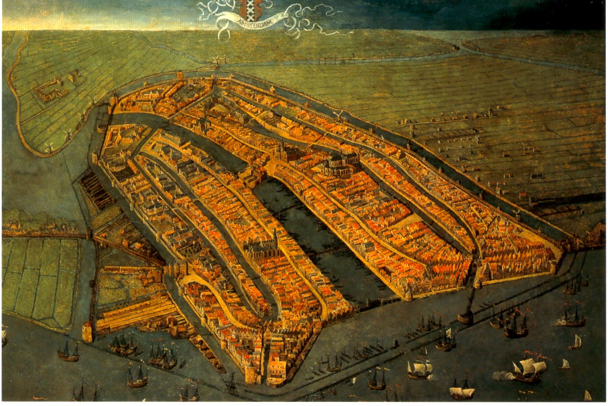
This oblique painting of Amsterdam was very large, striking and beautiful. This image is nice but can not convey the feeling you get when you're staring up at it on the wall. Go see for yourself!

This Buddhist world map (centered around mythological Mount Meru) offers a nice alternative perspective as did many of the other non Western maps. I also really liked a map that I believe I remember as having been drawn by the King of Cameroon though I can't seem to find any information on it from the web. They also had a stick chart from the Marshall Islands but I've already done that.

The lighting at the exhibits was poor in order to protect the maps but it made reading the details difficult. Maybe not a big problem for most people but I got a bit frustrated trying to see things.

Finally: The London Glove Map that was used in the promotional materials is really quite small. In fact it's the size of a glove. They tried to compensate by putting it in a large display case but that made it so you can't get close enough to it to read the details. Better to look at the pictures online if you want a good look at it.

Wednesday, May 28, 2008

MOTW @ the Baltimore Festival of Maps!

I finally made it to Baltimore for the Festival of Maps! The picture below is proof!

I spent a very good four hours at the Walters Art Museum (my normal museum limit is two) and could have spent even more time there if I had more stamina and fewer sleeping family members to consider. I could spend another four hours gushing about how great it was but I like to try and keep these entries manageable. If you want a really good, comprehensive review of the Maps: Finding Our Place in the World exhibit check out the Pond Seeker - his review is from the Chicago exhibit so it won't be identical but most of those maps are at the Walters also.
I will give a quick look at the highlights in this post and then maybe revisit the exhibit and other festival notes in a future post.

Logistics note: We drove down from Philly for the day-if I had it to do again I would have stayed overnight so I could have spent more time at the Walters and seen more of the satellite exhibits and events.

My favorite things from the exhibit were the more non-traditional maps, particularly this thing that looks like a back scratcher but is really an Inuit map of the coast of Greenland. Travel down the right side and you head south down the coast-as you go back up the left side you are heading further south. The shapes of the inlets are shown, but also the slope of the coastline is represented by the slopes on the wood so they had an idea of the coastal topography. Pretty clever-and we think they're primitive!

On the left is what is considered to be the "earliest known map drawn to scale" from Nippur, Babylonia - I had to steal this image from the Book of Joe - the blogging anesthesiologist. Thanks Joe!
There's so much more to say and show but it's very late so I will highlight more stuff when my mind is fresh!
Remember you only have until June 8th to see all this great stuff so hurry down to Bawlmor!

Thursday, March 20, 2008

Schmap of the Week

Schmap is a Widget you can add to your website to post info about your team, band, city, or other interests. Better to show then tell.


Below you can see the latest exploits of my favorite pathetic hockey team - the Flyers. Click a puck and see how they did in that location - you can also look at the arena - this works better in baseball when you're not looking at roofs. If you don't like them, which you probably don't, you can change the team or even the sport by clicking the buttons up top. Above, for a more international perspective is everyone's favorite French league team Paris St Germain.


You can also put up a city tourist guide - I picked Baltimore in honor of the Baltimore Festival of Maps.


Or you can follow your favorite musician such as Avril Lavigne - well she's not really my favorite but I sure like that heart-bone logo.

Thursday, March 13, 2008

Map of the Week 116-Baltimorrific!

For those of you like me who were foolish enough to miss the Chicago Festival of Maps, life has given you a second chance.
The Baltimore Festival of Maps begins Sunday with the opening of Maps: Finding Our Place in the World. This is the same exhibit that appeared at the Field Museum in Chicago, now making an east coast appearance at the Walters Art Museum in Baltimore. The Walters chose the London Glove map to represent their various mapping exhibits (there are several other exhibits and events going on at the museum).

As a fan of maps made by non-professionals, I'm really looking forward to seeing the Maps on Purpose exhibit. Art on Purpose, a community arts organization led various neighborhood map making workshops. Below are a couple of samples. Unfortunately the resolution on them is pretty coarse.


Of course I was curious to see where these neighborhoods are so I located them on yahoo maps. I used yahoo because I'm partial to their "micro-neighborhoods" even though they're often wrong. The map on the left is in Sandtown-Winchester, in the top right (NW) part of the map. The map on the right shows the Hollis Market-Union Square neighborhoods at the southern edge of the map.
One thing I have not found on the festival site is a map locating the events. Maybe someone (her majesty?) knows something I don't. I took the map below from yahoo and outlined in purple the area of the neighborhood map above and marked the Walters in a red asterisk. Now you know where to go and what to do. See you there?