Showing posts with label art. Show all posts

Wednesday, February 1, 2012

Maps from Memory

Illustrator Ellis Nadler started a group on flickr for maps drawn From Memory. There's a nice variety of artistry and accuracy here. One of the better ones is Montreal de memoire from Axel Drainville.


User 4ojos has some very nice maps on flickr. Here's Goa.

 
For some enjoyable inaccuracy here is the Nadler's Brazil featuring Rio on the wrong side of the Amazon and in the wrong hemisphere.

Brazil map from memory

His Australia's a little off too...

australia map from memory

...but not as bad as the one drawn by his "highly educated" friend.

Australia map from memory

Nadler simplifies London in case you get lost.
Map from memory

Here's his solar system in case you get lost there.
Map of solar system from memory

There's many more fun maps on this group so go waste some quality time! 

Thursday, December 15, 2011

Celebrating 150 Years of Italy Through Tables

Italy week continues with SESSANTUNA,  a collection of tables celebrating 150 years of Italian unity.


From the website of Cassina, the store that will be selling them:
SESSANTUNA is an art work consisting of 61 tables and designed as a historical retelling of Italy's unification. Every table, by Gaetano Pesce, is numbered in sequence according to the time when the state in question became part of the Union. Thus each one is historically relevant. The work also includes the smaller islands (Caprera, Elba, Lampedusa, Ischia, Ventotene and the Island of Montecristo), represented on a larger scale. The tables will be sold through an exclusive auction mechanism at the best Cassina stores (see the Where and How to purchase section).
The tables represent regional areas, not official regions or provinces. According to the site
the project is not meant as an accurate historical-geographical reconstruction of Risorgimento. 
Here are a couple of tables.

Molise, on the Adriatic coast


Immediately to the east is The Gargano, "Italy's Spur"


Wednesday, December 7, 2011

The Dogs of London

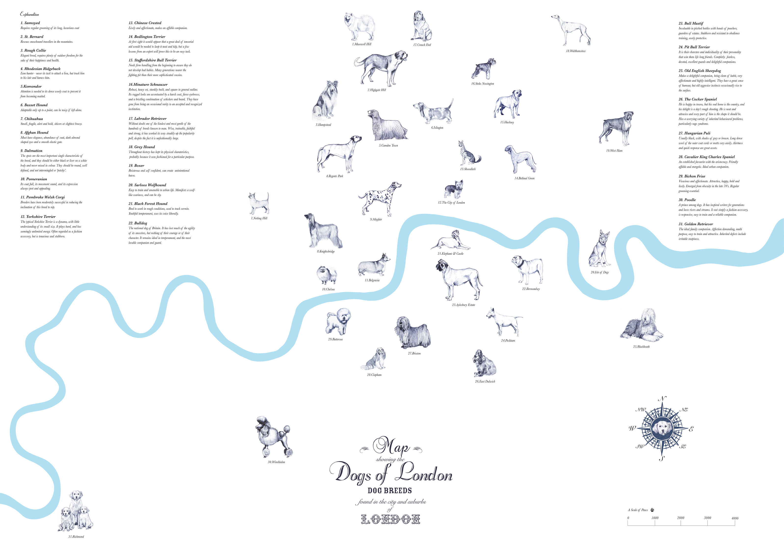
The Westbourne Grove Church Art Space in London recently held an exhibition titled The Dogs of London. The main feature was the Dogs of London map, a "playful take on social stereotypes and local observations" drawn by artist Anna Walsh.  A higher resolution image where you can read the tiny text is available here. Below is a detailed section - click to get the entire map.


Here is a description the exhibition's page:

The main feature is a Dogs of London Map; an illustrated map of where each dog 'lives' in London. It is inspired by traditional map drawings, especially of London, where the river Thames more often than not takes centre stage, splitting the city in half with its curvaceous, winding form. Each of the 35 dogs is placed in their postcode area, with an 'explanation' to the sides giving a brief description of each breed. Much of the text is taken from the book 'Champions Dogs of the World' by Richard Hamilton Glyn, as Walsh found the descriptions of the dogs often uncannily describing the inhabitants of certain areas…..
 Going along with the stereotypes and descriptions by the author one might say that residents of Hackney are "boisterous and self confident, can create unintentional havoc" whereas those from Shoreditch are "lively and affectionate" and will make "an affable companion." "Regular grooming" is  "essential" for the residents of Battersea.

Friday, December 2, 2011

December Map Crafts

Emily Garfield is a Boston area artist who creates "imaginary cartography." She will be showing her work in several area venues starting this weekend. Here are some of her maps - I have a few small prints of these.


Here is her Map Teapot, on display at Mobilia Gallery in Cambridge.


A short hop to the other side of the country will get you to the 23 Sandy Gallery in Portland, Oregon to see a globe exhibit called Welcome to My World - opening tonight!


Below is a work called "Underworld" by book artist and friend of the Map of the Week family, Susan Collard.


Several of the globes take on Global Warming as a theme. My favorite is this one by Bonnie Meltzer.


Finally, I'll leave you with Rebecca's Room by David Chelsea- acrylic paint on globe.


Thursday, October 20, 2011

Boylan Heights and the Poetics of Cartography

Denis Wood's recent book Everything Sings: Maps for a Narrative Atlas is featured on Places, an online journal of design. In the 1970's and 80's he began working with his students on a "narrative atlas" of the Boylan Heights neighborhood in Raleigh, North Carolina. These maps are unique in that they remove the usual street patterns to reveal the bare details. His map of jack-o'-lanterns from this series was featured here on a Halloween post a couple of years ago.  The Places feature has a slideshow of some of these maps. Here are a couple of examples:

Fences

Traffic Signs

Porch Ceiling Colors


The Places feature includes Wood's eloquent descriptions of the creative process. Here is a quote about making the "Pools of Light" map:
 The usual “efficient” map would have located everything on the street onto a single sheet — that is, different marks for lamp posts, fire hydrants, street signs, trees. Our inefficient map concentrated on a single subject, and, rather than lamp posts, it brought the pools of light into view. No legend, no north arrow, no neat line, none of the usual apparatus. At last, a modernist feel!

That’s when I knew we could write poems in maps, and I began thinking seriously about a poetics of cartography.
 A few more maps:

Intrusions Under the Hill - water, sewer and gas lines


Barking Dogs

Other maps include a map of power lines titled "Squirrel Highways", a mailman's delivery route, a diagram of the distance and direction that rent money travels to absentee landlords, wind chimes, viewsheds, and a bunch of others. The slideshow can be seen here.

Wednesday, September 14, 2011

Map of the Week Miscellany for September, 2011

There's a lot going on this week and if I only didn't have to work I could devote more time to these posts and make them more meaningful but be careful what you wish for. Anyway here are a few interesting items I've found this week:

An Army Corps of Engineers map of the flood control structures in Wilkes Barre, Pennsylvania.


 The manual this map appears in describes how the levees in Wilkes Barre and across the river in Kingston can form a bottleneck and make flooding worse for communities downstream. In 1972 these walls were too short to contain the flow from Tropical Storm Agnes and the city was flooded. The water stored from this flooding helped spare downstream places like Sunbury. Since then the levees have been raised, partially sparing Wilkes Barre from this weekend's floods (though water did get in by seeping under the levees.)

This sent more water to downstream places like Bloomsburg, where record setting flooding occurred.


Below is a map from the AP showing the some of the worst hit places.

Daniel Huffman's wonderful river schematic map shows how these places interconnect.


***********************************
Other Miscellaneous Notes:
***********************************
Tomorrow night (September 15th) David Byrne will squish an inflatable globe under the High Line in New York City. It will be there until October 1st. To sort of quote one of his songs "this was a parking lot, now it's all covered in globe." More information is available from New York Magazine.


************************************
From LA Taco ("Celebrating the taco lifestyle in Los Angeles") comes this chart showing the population growth of the largest cities in the USA. 


Wednesday, August 17, 2011

Map of the Week - Reverse Colonialism

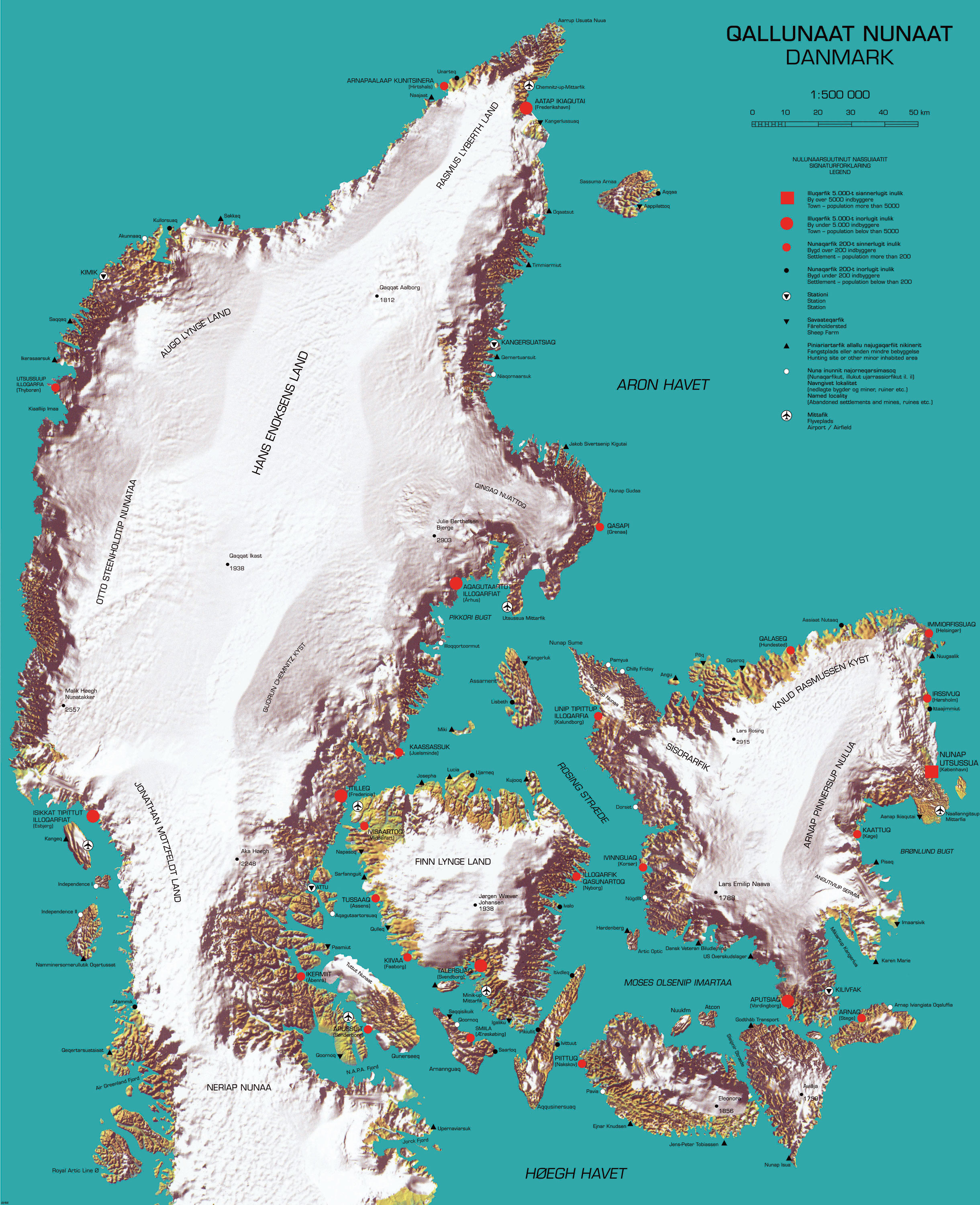
Here is a "cool" map that recently appeared on Strange Maps. It was produced by cinematographer and multimedia artist Inuk Silis Høegh for a project called "Melting Barricades," part of the  Rethinking Nordic Colonialism exhibit. The map pictures Denmark being colonized by Greenland, not just by the people but also by climate and topography.


Greenlandic names are imposed on places with the native Danish names in parentheses. The country name and title of the map is Qallunaat Nunaat (Danmark) and its largest city is Nunap Utsussua (København.) The coastline has become jagged from glacial erosion and the frozen interior named after native Greenlanders. The author also appears to have named a strait after himself, the Høegh Havet. 

There are a lot of details that escape me because I don't speak either of the languages and don't know my Illuqarfiks from my Nunaqarfiks. Some understandable (to English speakers) place names include "Chilly Friday" and "Air Greenland Fjord." 


Høegh also made a video called Attack-atigiit showing the Greenlandic occupation of Denmark. The language barrier prevents me from all the clever details but the general picture is clear. Below are some stills. The first one shows quizzical Danes studying the above map. At least I think that's the idea.


In this one Greenland is shown on a world map as a Mercator Giant, planting its flags around the world.


Thursday, June 16, 2011

Map of the Week-Recycled Africa

Anouk Zijlma is a travel writer who has lived in Africa and writes about it for About.com. She made this 4 foot high map of Africa from recycled tin cans. Her description follows:
 

The cans I used were specific to each country. I took into consideration team soccer colors, exports, favorite beers, and many of my personal experiences. The best oranges I ever tasted growing up came from South Africa. Nigeria drinks more Guinness than Ireland. Botswana exports diamonds and Zimbabwe exports flowers. The ocean was created from hundreds of Pepsi cans. All the cans are washed, cut and then nailed into wood. The only tools I needed was a hammer, small nails, a National Geographic map for accuracy, scissors, carbon paper and a friendly recycling plant.

Wednesday, February 9, 2011

Map of the Week-River Systems

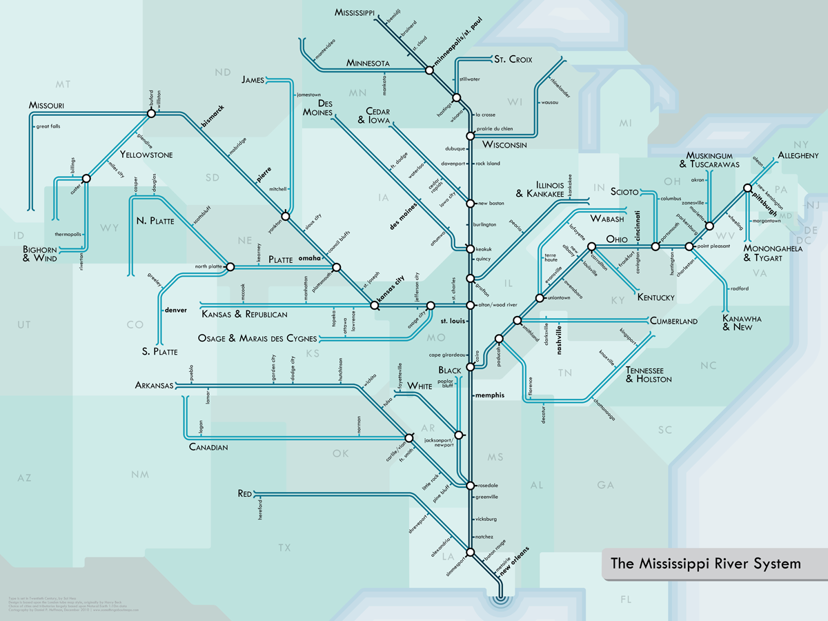
Last year, I featured a map from London's Waterways, using a Harry Beck London Underground inspired schematic.  Cartographer Daniel Huffman has created a beautiful series of schematics for various river systems here in the USA. Below is the Mississippi River System.


Details about the creation process can be found on his blog. Prints can be purchased here. Here are some nice detailed views from the series.

The Mississippi/Ohio jumble:

Boston Metro (from the "Southwest New England" map):
 
Michigan:

The Mighty Columbia:

Thanks to Cartogrammar for the heads up.

Thursday, January 20, 2011

Antarctica Art Article

Karen Bessette is an artist based in Manchester, New Hampshire who often incorporates maps into her collage works. I saw her at the Rhode Island School of Design Alumni Sale and bought this print titled "Antarctica I" from her Antarctica series. I don't a good place to hang it yet so I'll just put it on this page.

Friday, November 19, 2010

The World of Juan Nunez Guirado

Juan Nunez Guirado is an illustrator based in Spain who sent me a link to his work. Here is his world view.


He's done some nice pictorial maps and illustrations of various places in Spain. Here are some from Barcelona.


For a more detailed view, some soothing music and many more maps visit his website.

Thursday, June 24, 2010

Map of the Week Bonus Coverage

A week ago the Los Angeles Lakers won another NBA title - zzzzzzzzzzzzzzzzzzzz. To honor the occasion here's a map cartoon from the New Yorker by Michael Crawford titled "Los Angeles Getting More Annoying as We Speak."


Wednesday, May 12, 2010

Map of the Week-The Rejected Fortune 500 Cover

Fortune magazine likes to find creative artists to design their annual Fortune 500 issue. Here are some examples. However, after asking cartoonist Chris Ware (previously featured here for Jimmy Corrigan: The Smartest Kid on Earth) to design the May issue, they rejected his cover. Most likely, they didn't like the discomforting realism.
Reported on the Comics Beat site. Thanks to Cartophilia for pointing this one out.

Wednesday, March 10, 2010

Map of the Week-More Underground Fun

Last year I posted the Music Underground Map. Since then I have come across quite a few Harry Beck inspired alternative views of London. Here are some examples.

First, a map of London's waterways using a Beck-like design.


The map is from British Waterways although it does not seem to be available on their web site. I found it in this Guardian photo gallery.

For tourists, here is the Ultimate Uncluttered Tube Map.


This map shows where to find the nearest toilet on the subway system. No station names or any other text, just the toilets!


Similar to the waterways map is a Beck-like map of Great Britain's Motorway system. Here is a detail of the London area.


A web site called "Birmingham: It's not Shit" has a map of the Birmingham bus system based on Simon Patterson's Great Bear map. The Great Bear map named the Underground stations for famous people and categorized the lines by scientists, comedians, saints, philosophers, etc. The Birmingham version is called the Great Bull (named for the Bull Ring commercial district) and the stations are named for Brummies (people from or associated with Birmingham.) Birmingham is located at the upper left of the motorway detail map where the gray line meets the purple - unfortunately the name got chopped off when I edited the photo.
Here is a detail from the Great Bull map and legend.


The 2012 Olympics are coming to London. Here, the Tube Map is redesigned as the Olympic rings.


Finally, I leave you with this "distinctive interpretation" from artist David Shrigley.