Showing posts with label transit. Show all posts

Wednesday, February 29, 2012

Super Commuting

A new report from NYU's Rudin Center for Transportation Policy and Management details the rise of the "super commuter" - someone who commutes from one metropolitan area to another. The report is summarized in an article in the Atlantic Cities. This map shows "non-local labor sheds" for major U. S. cities.

The stars are the commuting destinations while the graduated circles represent the home areas of commuters from outside the region. I like the gratuitous inclusion of Puerto Rico at the bottom right of these maps.

According to the study, these commuters tend to be younger people with modest incomes and may be making these commutes to take advantage of more affordable housing. Many of them probably don't need to show up in the office more than a couple of times a week. Two of the top super commutes are Houston to Dallas and Dallas to Houston. Sounds like a recipe for a house swap reality show.

I grabbed this image directly from the report as a typical detail of one of these areas - in this case Chicago.


 The darker reds represent larger percentage increases. While Detroit had the largest percentage increase, it is still coming from a much smaller number of actual commuters,. Cities such as Champaign and Saint Louis had higher absolute increases. I don't know why Milwaukee is so much smaller than the other cities when it is so close by - better job market there?

Wednesday, May 4, 2011

Map of the Week-Mexico City's Subway Station Icons

When Mexico City designed it's subway system in the 1960's there was widespread illiteracy (not so anymore.) They came up with a solution of visual signs such as colors and icons. Each station has a unique logo or icon based on local points of reference, history, nature, etc.


For example the Pino Suarez station icon depicts an Aztec pyramid that was discovered during the construction of the station.

Salto del Agua shows a local fountain and Merced shows a box of apples because it's located adjacent to one of the largest outdoor markets in the city. The stories behind most of these icons can be found by clicking the station name from this wikipedia page.


The image above is a detail from this image from Wikipedia.


I discovered these icons when I was working on my Maps on Album Covers project. One of my favorite "Rock en Espanol" bands Cafe Tacvba (not a typo) put a fake subway diagram with fake icons on their Cuatro Caminos album. The album is named for a real subway station, but the others on this map appear to be whimsical creations.


Here is the real area around Cuatro Caminos - the geodesic dome is a former bullfighting arena.


Wednesday, February 9, 2011

Map of the Week-River Systems

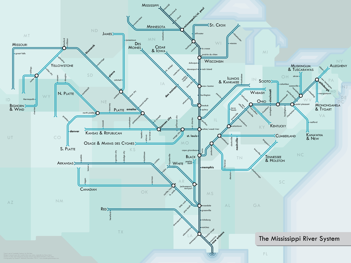
Last year, I featured a map from London's Waterways, using a Harry Beck London Underground inspired schematic.  Cartographer Daniel Huffman has created a beautiful series of schematics for various river systems here in the USA. Below is the Mississippi River System.


Details about the creation process can be found on his blog. Prints can be purchased here. Here are some nice detailed views from the series.

The Mississippi/Ohio jumble:

Boston Metro (from the "Southwest New England" map):
 
Michigan:

The Mighty Columbia:

Thanks to Cartogrammar for the heads up.

Wednesday, March 10, 2010

Map of the Week-More Underground Fun

Last year I posted the Music Underground Map. Since then I have come across quite a few Harry Beck inspired alternative views of London. Here are some examples.

First, a map of London's waterways using a Beck-like design.


The map is from British Waterways although it does not seem to be available on their web site. I found it in this Guardian photo gallery.

For tourists, here is the Ultimate Uncluttered Tube Map.


This map shows where to find the nearest toilet on the subway system. No station names or any other text, just the toilets!


Similar to the waterways map is a Beck-like map of Great Britain's Motorway system. Here is a detail of the London area.


A web site called "Birmingham: It's not Shit" has a map of the Birmingham bus system based on Simon Patterson's Great Bear map. The Great Bear map named the Underground stations for famous people and categorized the lines by scientists, comedians, saints, philosophers, etc. The Birmingham version is called the Great Bull (named for the Bull Ring commercial district) and the stations are named for Brummies (people from or associated with Birmingham.) Birmingham is located at the upper left of the motorway detail map where the gray line meets the purple - unfortunately the name got chopped off when I edited the photo.
Here is a detail from the Great Bull map and legend.


The 2012 Olympics are coming to London. Here, the Tube Map is redesigned as the Olympic rings.


Finally, I leave you with this "distinctive interpretation" from artist David Shrigley.

Thursday, July 9, 2009

Map of the Week-The Music Underground

A few years ago music writer Dorian Lynskey created this map for the Guardian, charting the history of recent western music along Harry Beck's famous London Underground map. Each line represents a musical genre. The more eclectic artists are at the intersections. The Circle Line represents Pop music because it intersects all the other genres.
Of course, it is not possible to do this without leaving out important artists or placing others in debatable locations. In the words of the author: "Pedants, of course, will find flaws. Musical influences are so labyrinthine that any simple equation will be imperfect." Still I can't help but wonder what Wilco has to do with Electronica and Dance or why the late King of Pop Michael Jackson is only on the Soul line.

Some of the article's comments are amusing too such as this one: "The most stereotypically self-indulgent Guardian wank I can think of, bordering on self parody. Smug, London obsessed (and I live in London) nonsense. It's got nothing to do with anything! There's people like, dying and stuff. And where are the Arctic Monkeys, anyway...?"

The full map at low resolution is below. For a detailed .pdf version link to the article from the thumbnail above.

Wednesday, July 16, 2008

Map of the Week-Britain Travel Time Maps

My Society has produced some nice travel time maps for Great Britain that you can see here. I particularly like this one comparing travel time by car and train from Cambridge. The red areas are quicker by train, orange is about the same and then yellow to green to blue gets gradually faster by car.

A couple of disclaimers about this map from their site:
"the road travel model takes no account of traffic or urban areas, so it is pessimistic about the time saving"
"However, the model of car journey times is very simplistic, so these results should not be taken too seriously—we hope to extend the work with a more realistic model of driving times, which may substantially change the comparative results."

Wednesday, June 25, 2008

Map of the Week - Subwayman

I'm not nearly New Yorky enough to read the New Yorker but John G. alerted me to the current issue's (June 30, 2008) cover. It's "Subway Man" by Roz Chast. Thank you John.

Thursday, June 19, 2008

Map of the Week-Mapping Web Trends

Information Architects Japan produces this map of web trends. In their own words:

"The map pins down nearly 300 of the most successful and influential websites to the greater Tokyo area train map. Different train lines correspond to different web trends such as innovation, news, social networks, and so on."


I've spent a fair amount of time looking over this subway map of Tokyo for the similarities and they're not obvious. However, there is a detailed description of the various lines and the how changes in web traffic affect the placement of sites.
Here's a description (and map) of google's recent promotion to Tokyo's central station.

"In terms of traffic, Tokyo station is the center of Tokyo. That’s why Google (which is slowly becoming a metaphor of the Internet itself) has moved from Shinjuku to Tokyo Station. Google continues to push new modules into the main lines in an attempt to occupy the center circle."
Hey look! Blogger's on there! Maybe Map of the Week will earn its own station someday!

Thursday, April 10, 2008

Map of the Week 120-Boston Squared

Next week the Association of American Geographers holds their annual meeting here in Boston, a city so confusing even a geographer can get lost. The folks at Radical Cartography put out the map below to try and help demystify the "squares" of Boston. In Boston a square is not actually shaped like a square as it is in places like Philadelphia and Savannah. A square is a place where streets come at you from all kinds of directions. If you're crazy enough to try driving through one of them you have about a 10% chance of ending up where you want and about an 85% chance of ending up frustrated, angry or in a pile of twisted metal (these stats have not been verified).
Of course the map below won't help you find your way much either. You're better off taking the T and using their map. What this map does accomplish is to indicate where all these squares are. People here navigate by square names and they are omitted from most maps. So when someone tells to to go to Copley Square for the AAG meeting you'll know where to go. And if they tell you about a great donut shop in Union Square you'll at least be able to narrow it down to two places.

Some of these square names may be a bit too literal - yes Newton Corner is technically called "Nonantum Square" but nobody really calls it that (causes confusion with Nonantum Village). And J. Elliot? C'mon! We all know it's "The Dudley". Anyway if nothing else the map is an alternate view of Boston from a local perspective. So welcome to town geographers, have a lovely stay and don't venture too far on your own without a good map or you may get lost in some confusing square like this one.

Friday, December 14, 2007

Map of the Week #103 - Transit Maps of the World

My in-laws gave me a real nice Hanukkah gift - Mark Ovenden' s "Transit Maps of the World". This book is described by boingboing as "sheer subway porn". The map below is from the inside cover and shows a fanciful map, based on Harry Beck's famous London Underground maps linking all of the World's transit systems. Imagine a quick ride on the red line to Istanbul or Shanghai or with one switch at Newark, an easy ride to Vancouver, Buffalo or Ufa! OK, I better stop before I get too excited.

Thursday, September 7, 2006

MOTW #43

This one's almost as cool as the LA Airport Monitor. Watch boats travel around the San Francisco Bay, get information about each boat, its destination and ETA. Give the boats a minute or two to load and then let them do their stuff!

Thursday, May 4, 2006

MOTW #28

Another cool java application. Watch planes take off and land at LAX. I can sit and watch this for hours!
UPDATE: It appears that LAX no longer participates with Passur and some of the other airports don't seem to be loading anything. The image above now links to Newark International instead where there is still some action to watch. If nothing's happening in Newark you can try some of their other airports.

Friday, April 28, 2006

MOTW #27

This is really cool and useful too. A map showing where all the trains in Copenhagen are and tracking their movements. Warning - if you don't have java it won't work correctly and if you do you may have to wait a bit for the trains to appear.

Thursday, March 9, 2006

MOTW #20

Anagram transit maps are suddenly all the rage. You may find your favorite city at Boing Boing
where you can spend hours of fun.
Here's one for Boston: