Showing posts with label los angeles. Show all posts

Wednesday, March 7, 2012

The Geotagger's World Atlas

Eric Fischer's Flickr photostream has lots of interesting maps. He has put together The Geotagger's World Atlas, a series of maps showing the locations of geotagged images from Flickr and Picasa. These maps (all covering 15 square miles) reveal the contrasting patterns of world cities from the highly centralized European cities such as Amsterdam, to the sprawling multinodal Los Angeles.

The Geotaggers' World Atlas #47: Santa Monica and western Los AngelesThe Geotaggers' World Atlas #14: Amsterdam   

To add color and interest, he also has a set called Locals and Tourists with color coded dots - blue for locals red for tourists and yellow for not certain. Most cities have the red dots in the central areas and clustered at beaches, sports arenas and amusement parks. San Francisco (his hometown?) has a nice concentration of red all along the Golden Gate Bridge and red clusters in various tourist destinations, including Alcatraz.

Locals and Tourists #3 (GTWA #4): San Francisco

The lines in these maps connect pictures that were taken in a series.

Paris shows an east-west split. The red area at the lower left edge is probably Versailles.

Locals and Tourists #4 (GTWA #3): Paris

The Asian cities show some surprisingly spread out settlement patterns. Here is Taipei.Locals and Tourists #9 (GTWA #55): Taipei

I'll finish off with Tokyo and its nice, artistic pattern.
Locals and Tourists #5 (GTWA #20): Tokyo

Wednesday, September 14, 2011

Map of the Week Miscellany for September, 2011

There's a lot going on this week and if I only didn't have to work I could devote more time to these posts and make them more meaningful but be careful what you wish for. Anyway here are a few interesting items I've found this week:

An Army Corps of Engineers map of the flood control structures in Wilkes Barre, Pennsylvania.


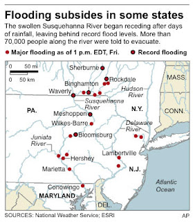
 The manual this map appears in describes how the levees in Wilkes Barre and across the river in Kingston can form a bottleneck and make flooding worse for communities downstream. In 1972 these walls were too short to contain the flow from Tropical Storm Agnes and the city was flooded. The water stored from this flooding helped spare downstream places like Sunbury. Since then the levees have been raised, partially sparing Wilkes Barre from this weekend's floods (though water did get in by seeping under the levees.)

This sent more water to downstream places like Bloomsburg, where record setting flooding occurred.


Below is a map from the AP showing the some of the worst hit places.

Daniel Huffman's wonderful river schematic map shows how these places interconnect.


***********************************
Other Miscellaneous Notes:
***********************************
Tomorrow night (September 15th) David Byrne will squish an inflatable globe under the High Line in New York City. It will be there until October 1st. To sort of quote one of his songs "this was a parking lot, now it's all covered in globe." More information is available from New York Magazine.


************************************
From LA Taco ("Celebrating the taco lifestyle in Los Angeles") comes this chart showing the population growth of the largest cities in the USA. 


Tuesday, December 21, 2010

Map of the Week-Census Preview

Last week the New York Times put out this nice interactive map showing some of the latest data released from the Census Bureau. The dot maps are the most interesting. They nicely illustrate patterns of race:


and income:


The entire country is covered so you can zoom, pan or choose a location. If you zoom too far in you lose the patterns a bit and also get some misleading information because each dot represents multiple people, not individual households.


 To really see the patterns of segregation, zoom out.


Here's a larger city with a more diverse breakdown.


The income map reveals the inner city income holes that are prevalent in older cities like Baltimore, but less so in Washington D.C. where there is much more inner city wealth.


If you zoom out a ways the dots seem to follow county boundaries. Zooming in arranges them in a more realistic pattern. I'm not sure what algorithm produces that result.


Happy Holidays and may your next year be filled with new census maps!

Thursday, June 24, 2010

Map of the Week Bonus Coverage

A week ago the Los Angeles Lakers won another NBA title - zzzzzzzzzzzzzzzzzzzz. To honor the occasion here's a map cartoon from the New Yorker by Michael Crawford titled "Los Angeles Getting More Annoying as We Speak."


Wednesday, December 16, 2009

Bruce, Bruce and Tom-A Musical Journey

I've always been interested in the geography of musicians-where they come from, where they get discovered, and where they choose to reside when success allows them that choice. I've found a few nice musician maps over the last couple of years. These three artists were chosen because someone made maps for them, more than for any personal preference.

Bruce Cockburn was born and raised near Ottawa but has spent most of his musical career in Toronto. He currently resides near Kingston, Ontario according to his web site. Here is a clickable map of his life in Toronto:


If you prefer the other Bruce, here is a map of  Springsteen's New Jersey titled "Bruceville." Bruce Springsteen is that rare musician who's never needed to stray too far from home and has always remained true to the Garden State.

This map is more fanciful than accurate. The only places that really seem to be located correctly are the Boardwalk, Highway 9 and his father's house. Little Eden is Millville? "The River" is the Delaware? "Tenth Avenue Freeze Out" is about Tom's River? * I have my doubts about these things. Thanks to Strange Maps for this.                                                        * After consulting Wikipedia, the undisputed source of all knowledge, it turns out the "Tenth Avenue Freeze Out" may actually refer to 10th Avenue in Belmar. If true then the map is close.

Shortly before his Super Bowl XLII appearance, LA Weekly published this map  of Tom Petty's Los Angeles by illustrator Scott Gursky. Although a native of Florida, Petty moved to LA at the beginning of his career and has remained in the area ever since. The article details each place on the map.


Wednesday, October 8, 2008

Map Channels - Useful Content!

Map Channels is a service that lets you embed a custom map into your website or blog. In addition they have numerous "channels" to look at local events, book hotels and look at street views. They also have a nice function to compare Google Maps with Virtual Earth.
When you get past the flashy "cool" stuff there's actually some very useful functions here. Going to Los Angeles? Need to know what's happening? Below is a map of upcoming events. What's really nice about this is it's actually current to today! Usually these things are months out of date. Oh, and they have your city too. I know because I've checked.

Need a hotel? Here's a map of available hotel rooms in San Jose del Cabo, Mexico. Click a dot and make the reservation!


Here's another cool "channel" - free things to do in London. OK so most of them are parks - I can live with that.

Thursday, May 1, 2008

Map of the Week 123-Happy May Day!

Folks these days just don't seem to know how to have fun on May Day like we did back in 2001.


Back then in London we rode our bikes wearing fluorescent wigs, gave Winston Churchill a "mohican-style haircut", illegally fed pigeons, and carried signs saying "overthrow capitalism and replace it with something nice." Nowadays we have Bank Holidays , Mayoral elections and Beardyman. Bloody drab mates! And not even a good map of the events.

Maybe you should just go to Ickwell and dance around the maypole.


Here in the USA there will be lots of marches but not a whole lot of good maps. I found some maps showing road closures courtesy of the Los Angeles Dept of Transportation and that's about all. So try to enjoy your May Day despite the dearth of good maps.

Thursday, May 18, 2006

MOTW #30

This is a ridiculously clever map showing an index of happiness in LA using 4 separate variables, each showing a facial trait representing differing levels of stress or racial makeup. These are Chernoff Faces, a visualization technique created by mathematician Herman Chernoff. The map was created in 1971 by Cal State geography professor Eugene Turner for the Los Angeles Community Analysis Bureau.

Thursday, May 4, 2006

MOTW #28

Another cool java application. Watch planes take off and land at LAX. I can sit and watch this for hours!
UPDATE: It appears that LAX no longer participates with Passur and some of the other airports don't seem to be loading anything. The image above now links to Newark International instead where there is still some action to watch. If nothing's happening in Newark you can try some of their other airports.