Showing posts with label catastrophe voyeurism. Show all posts

Wednesday, October 12, 2011

Map of the Week-Shipwrecks of the Delmarva

National Geographic features Shipwrecks of the Delmarva on their maps page. I never would have guessed that the chicken farms on Route 13 were perched on such treacherous soil. Here is a detailed view from the Zoomify interface.


From the web page:
Developed by renowned marine archaeologist and accomplished author Don Shomette, and designed by award-winning cartographer Robert Pratt, Shipwrecks of Delmarva is a stunning cartographic piece based on years of research and expert visual design.
I can't resist a few more detailed views.


The burning ship in this last one represents the amazing 2011 Phillies playoff run. Or maybe the gently sinking Rose is the better metaphor - it's just downstream from the stadium.

Wednesday, September 14, 2011

Map of the Week Miscellany for September, 2011

There's a lot going on this week and if I only didn't have to work I could devote more time to these posts and make them more meaningful but be careful what you wish for. Anyway here are a few interesting items I've found this week:

An Army Corps of Engineers map of the flood control structures in Wilkes Barre, Pennsylvania.


 The manual this map appears in describes how the levees in Wilkes Barre and across the river in Kingston can form a bottleneck and make flooding worse for communities downstream. In 1972 these walls were too short to contain the flow from Tropical Storm Agnes and the city was flooded. The water stored from this flooding helped spare downstream places like Sunbury. Since then the levees have been raised, partially sparing Wilkes Barre from this weekend's floods (though water did get in by seeping under the levees.)

This sent more water to downstream places like Bloomsburg, where record setting flooding occurred.


Below is a map from the AP showing the some of the worst hit places.

Daniel Huffman's wonderful river schematic map shows how these places interconnect.


***********************************
Other Miscellaneous Notes:
***********************************
Tomorrow night (September 15th) David Byrne will squish an inflatable globe under the High Line in New York City. It will be there until October 1st. To sort of quote one of his songs "this was a parking lot, now it's all covered in globe." More information is available from New York Magazine.


************************************
From LA Taco ("Celebrating the taco lifestyle in Los Angeles") comes this chart showing the population growth of the largest cities in the USA. 


Wednesday, September 7, 2011

Map of the Week - About that Tropical Storm

My colleagues in Vermont are doing a great job providing timely data for disaster responders under difficult circumstances. The Vermont Center for Geographic Information's offices have been flooded for the last week and a half but they are up and running. Meanwhile the Vermont Agency of Transportation is publishing and updating this detailed map every 12-24 hours.


Here's a detail from Wardsboro, a town I've spent time in and that was until recently inaccessible.


It's a big, colorful mess over there but they're still hoping to be open for the upcoming foliage season when things get really colorful.

Wednesday, August 24, 2011

Map of the Week - About that Earthquake

So we had this earthquake yesterday. OK 5.8 is nothing by west coast standards but when it happens on the east coast it's really important! I'd love to see a map of all the tweets because they apparently traveled quicker than the quake itself. There were reports of people seeing the tweets before feeling the quake. Of all the maps out there, this one from Joe Hanson is clearly the most informative.   


Anyway, the Baltimore Sun shows this map from the USGS showing the intensity felt by color. They use a detailed questionnaire to make it a bit less subjective. 


Here is a link to other USGS maps. Hope you survived. I didn't feel a thing but I was on my bicycle and everything feels bumpy from there.

Wednesday, March 16, 2011

Map of the Week-Nuke Plants in Earthquake Zones

The awful events going on in Japan made me curious about where else in the world there are nuclear plants in earthquake zones. Fortunately maptd had the same idea so they did all the work for me. Click the map below to get to their post and link to a google "heat map" of earthquake areas with a nuke plants overlay.


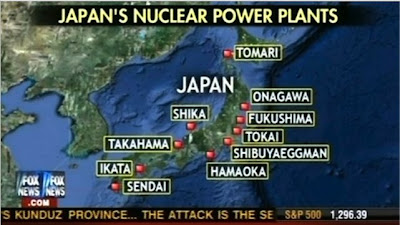
I was not previously familiar with the maptd blog but they have some excellent coverage of the mess in Japan including before and after pictures. They also include this Fox News "map fail" showing Japan's nuclear plants that includes the Shibuya Eggman, a nightclub in Tokyo. The map also missed several plants according to this wikipedia entry.


Wednesday, January 13, 2010

Map of the Week-Haiti Quake Maps

I don't like to gawk at natural disasters. However, yesterday's earthquake in Haiti is so horrific that's it's a tough one to ignore. The U. S. Geological Survey's PAGER (Prompt Assessment of Global Earthquakes for Response) has some useful maps and graphics to illustrate the severity of the situation. Here are the most recent earthquakes on PAGER with the Haiti quake detailed.


Here are some maps from the PAGER's Haiti earthquake page. First, a graph showing the color codes.

 This is the "shakemap" showing the quake intensity. To the right, a list of the most affected cities using the same color codes.


Finally, a map showing population density (in gray) with the quake intensity shown as colored isolines.

Thursday, May 15, 2008

Map of the Week 125-Asian Disasters

It's been tough finding good maps of the earthquake area in China. The BBC wins out again with this map although the scale is a bit too zoomed in to get a good sense of the surrounding areas. You do get a sense of how close Chengdu, a city of about 4 million people, is to the epicenter and how severe the quake was there. You can click on the affected cities and get more information - or just scroll down on the same page.


One of the more tragic aspects of the China quake is how it has made many of us forget about the cyclone in Myanmar-Burma (Whatever you prefer to call it) where another city of 4 million Yangon-Rangoon (Whatever you prefer to call it) has been hit.
This is a set of before and after satellite images of Cyclone Nargis from the NASA Earth Observatory. The after image shows the extent of flooding as of May 5th using a combination of color and infrared light to clarify the floodwaters.
Anyway be thankful if you're not in one of these places and hopefully we'll all donate a little to help these people-it could be any of us next time.