Showing posts with label energy. Show all posts

Wednesday, March 16, 2011

Map of the Week-Nuke Plants in Earthquake Zones

The awful events going on in Japan made me curious about where else in the world there are nuclear plants in earthquake zones. Fortunately maptd had the same idea so they did all the work for me. Click the map below to get to their post and link to a google "heat map" of earthquake areas with a nuke plants overlay.


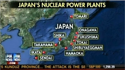
I was not previously familiar with the maptd blog but they have some excellent coverage of the mess in Japan including before and after pictures. They also include this Fox News "map fail" showing Japan's nuclear plants that includes the Shibuya Eggman, a nightclub in Tokyo. The map also missed several plants according to this wikipedia entry.

Wednesday, September 8, 2010

Map of the Week-Maine Expedites Wind Power

I just got back our annual trip to Maine. The trip primarily involves the following steps.
1. throw a tennis ball into the lake
2. watch the dog bring it back
3. repeat
4 - infinity. repeat

Remy taking a rare break


In between throws I got a little reading done. This article about wind energy from the Maine Center for Public Interest Reporting (reprinted in the Lincoln County News) caught my attention because it's largely about a map the state made under poorly documented circumstances. The map shows sites where wind turbines can get "fast track" consideration. Maine passed a law in 2008 designed to get wind projects moving with a goal of generating 2000 megawatts by 2015.

The map in question does not appear to be freely available to the public. Official records from the meetings where the map was drawn also appear to be non-existent. In fact, the whole process seems to be poorly documented and full of questionable connections between politicians and industry insiders. These projects are causing a rift among environmental groups with some of the groups seeing more harm than good. Beyond the usual "NIMBY" concerns about noise, property values and visual blight, there is also the required cutting of forests, installation of transmission lines, modest power output and much of the power and money being funneled out of state.   

The map was approved by the state legislature as a first step in deciding which projects should be built where and does not guarantee approval. While that map is not available, here is a map from the National Resources Council of Maine showing present and possible future wind projects.


Most of these projects are mountain top sites. The term "In Development" seems optimistic as it appears to mean that permits have been submitted, not necessarily approved. The "Under Construction" category is apparently nowhere-but it seems that the state is hoping the next version of this map will have some yellow stars.

Thursday, August 19, 2010

Confusing Map of the Week-Oil and Much More

Preemptive Media is an organization that lets participants monitor air quality with GPS enabled monitoring devices. However, this post is not about that. This post is about the confusing map they have posted on their web page.

It's an interesting visualization but full of cartographic problems. First of all too much information takes away from the focus on US oil imports. The title and blocks of text at the bottom about gas and coal confuse the reader about what the map actually shows. It's not a map about all fossil fuels, just one. The country sizes are also confusing - is this supposed to be a cartogram? I'm pretty sure it's not. The colors? I guess they're just colors and have no additional meaning. They did get it right in sizing (by width) the connecting pipelines according to the number of barrels a day we import.

Nevertheless this map does show some interesting statistics about where our oil comes from. Canada and Mexico are our top two sources for oil? Ecuador's in the top ten? Who knew? I also like the chart at the lower right showing how we create greenhouse gases.

One solution to the "Fossil Fuel Fix"

Get a zero emissions car and race it around the world! The Zero Emissions Race is sending four teams (Switzerland, Germany, South Korea and Australia) on an "Around the World in 80 Days" race. The vehicles are all electric and the costs of the energy (including transport across two oceans) will be "offset". They left from UN Headquarters in Geneva, Switzerland on Tuesday and two of the vehicles are currently in Mainz, Germany.

For some reason the other two vehicles are nowhere to be found.


Here is the route they will be taking around the world.

Friday, May 21, 2010

Map of the Week Oil Slick Update

There is a cool app on the Google Lat Long Blog where you can compare the size of the oil spill to your own corner of the world. That way you get a better sense of how large this disaster really is. People love to compare things to Rhode Island but try and you'll see it's much bigger. In fact it's threatening to swallow New Jersey whole.

Wednesday, May 19, 2010

Map of the Week-Deepwater Drilling and Spilling

The New Orleans Times-Picayune has some very detailed coverage about the BP Deepwater Horizon Oil Spill in the Gulf of Mexico. There are lots of maps and graphics showing how the spill happened, what BP is trying to do to contain it, fishing closures and the extent of the damage. You can also read some fascinating comments. Blame an accident by a British oil company on whatever US politician you don't like. Choose the comments that work for your agenda!

Here is an image from NASA. Not pretty.


Below are forecasts of the extent of the oil slick for today and tomorrow.


They also have a map animation. Click on the image below to see.    


Thursday, January 17, 2008

Map of the Week 108-Got Biomass?

OK - I couldn't resist the dopey cliche of stealing from milk commercials - everyone else is doing it!
The National Renewable Energy Lab in Golden, Colorado is working on an atlas of renewable resources for the USA. They have put together a bunch of maps showing potential development of Solar, Wind, Hydrogen, Biomass and Hydrogen as energy sources. Their color choices are a bit confusing but the patterns are clear enough. Here's a biomass map with their description below:

"These maps estimate the technical biomass resources available in the United States by county. Biomass feedstock data are analyzed both statistically and graphically utilizing geographic information systems (GIS). The following feedstock categories are considered for this study: crop residues, methane emissions from manure management, methane emissions from landfills and wastewater treatment facilities, forest residues, primary and secondary mill residues, urban wood waste, and dedicated energy crops."

Of course when you normalize it by population the results are slightly different - especially down in the Southwest where they suprsize their counties:

Thursday, August 9, 2007

MOTW #87

These maps are "wind speed grids" for New England. The heights (30m, etc) in the upper corners are the height at which the wind speeds were measured. This study was done by Truewind Solutions to get an idea of how much wind power can be derived from wind turbines of different heights and locations.
If you really want the whole in depth analysis you can go to the Mass. Technology Collaborative and get a detailed wind map for areas within souther New England.