Showing posts with label nature will kill ya. Show all posts

Thursday, September 15, 2011

Bonus Tropical Storm Coverage

From NASA's Earth Observatory page:


Nearly a week after Hurricane Irene drenched New England with rainfall in late August 2011, the Connecticut River was spewing muddy sediment into Long Island Sound and wrecking the region's farmland just before harvest. The Thematic Mapper on the Landsat 5 satellite acquired this true-color satellite image on September 2, 2011.

It's also interesting to see the comparison of the Connecticut with the Thames River. When I first looked at the image, I assumed that there was less sediment from the Thames because its drainage area received less rainfall but that's not the only reason:

To the east, the Thames River appears to be carrying very little sediment at all on September 2. According to O'Connell, the Thames "drains glaciated terrain, so fine sediment was removed long ago." Most of the land surface in the Thames basin is "just bedrock, till, and glacial erratics." Unlike the Connecticut, areas within the Thames watershed only received 2 to 4 inches of rain in most locations.

Wednesday, September 14, 2011

Map of the Week Miscellany for September, 2011

There's a lot going on this week and if I only didn't have to work I could devote more time to these posts and make them more meaningful but be careful what you wish for. Anyway here are a few interesting items I've found this week:

An Army Corps of Engineers map of the flood control structures in Wilkes Barre, Pennsylvania.


 The manual this map appears in describes how the levees in Wilkes Barre and across the river in Kingston can form a bottleneck and make flooding worse for communities downstream. In 1972 these walls were too short to contain the flow from Tropical Storm Agnes and the city was flooded. The water stored from this flooding helped spare downstream places like Sunbury. Since then the levees have been raised, partially sparing Wilkes Barre from this weekend's floods (though water did get in by seeping under the levees.)

This sent more water to downstream places like Bloomsburg, where record setting flooding occurred.


Below is a map from the AP showing the some of the worst hit places.

Daniel Huffman's wonderful river schematic map shows how these places interconnect.


***********************************
Other Miscellaneous Notes:
***********************************
Tomorrow night (September 15th) David Byrne will squish an inflatable globe under the High Line in New York City. It will be there until October 1st. To sort of quote one of his songs "this was a parking lot, now it's all covered in globe." More information is available from New York Magazine.


************************************
From LA Taco ("Celebrating the taco lifestyle in Los Angeles") comes this chart showing the population growth of the largest cities in the USA. 


Wednesday, September 7, 2011

Map of the Week - About that Tropical Storm

My colleagues in Vermont are doing a great job providing timely data for disaster responders under difficult circumstances. The Vermont Center for Geographic Information's offices have been flooded for the last week and a half but they are up and running. Meanwhile the Vermont Agency of Transportation is publishing and updating this detailed map every 12-24 hours.


Here's a detail from Wardsboro, a town I've spent time in and that was until recently inaccessible.


It's a big, colorful mess over there but they're still hoping to be open for the upcoming foliage season when things get really colorful.

Wednesday, August 24, 2011

Map of the Week - About that Earthquake

So we had this earthquake yesterday. OK 5.8 is nothing by west coast standards but when it happens on the east coast it's really important! I'd love to see a map of all the tweets because they apparently traveled quicker than the quake itself. There were reports of people seeing the tweets before feeling the quake. Of all the maps out there, this one from Joe Hanson is clearly the most informative.   


Anyway, the Baltimore Sun shows this map from the USGS showing the intensity felt by color. They use a detailed questionnaire to make it a bit less subjective. 


Here is a link to other USGS maps. Hope you survived. I didn't feel a thing but I was on my bicycle and everything feels bumpy from there.

Wednesday, March 16, 2011

Map of the Week-Nuke Plants in Earthquake Zones

The awful events going on in Japan made me curious about where else in the world there are nuclear plants in earthquake zones. Fortunately maptd had the same idea so they did all the work for me. Click the map below to get to their post and link to a google "heat map" of earthquake areas with a nuke plants overlay.


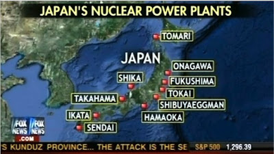
I was not previously familiar with the maptd blog but they have some excellent coverage of the mess in Japan including before and after pictures. They also include this Fox News "map fail" showing Japan's nuclear plants that includes the Shibuya Eggman, a nightclub in Tokyo. The map also missed several plants according to this wikipedia entry.


Wednesday, August 25, 2010

Map of the Week-Pakistan Floods

Flooding in Pakistan has affected more than 17 million people and is "the worst natural calamity of its history" according to Prime Minister Yousuf Raza Gilani. In addition to the 1.2 million homes that have been destroyed there are also problems with water borne diseases, sanitation, lack of medical staff and supplies, destruction of agriculture and growing political unrest. See the BBC for sources and details.

The floods have destroyed more than 17,000 sq km (6,600 sq miles) of land and affect a huge percentage of the country.

Comparing this area side by side with a population density map from Wikipedia gives a good picture of the degree to which the population of the country has been affected.


A list of places to donate money or supplies is available at the Pakistani site Chowrangi.

Wednesday, June 30, 2010

Map of the Week-GOOD Volcano Map

GOOD is an online journal that asks the question "what is good right now?" One of the highlights is their "transparency" series of graphics and maps. The latest transparency shows how small the recent Eyjafjallajökull volcanic eruption in Iceland was compared to other historic volcanoes. The disruption to the economy and to air traffic was huge but as the graphic indicates we should expect much worse in the future.


The tall orange triangles on the map are "decade volcanoes." I've never heard that term either but according to the description page it means a volcano "currently noted to have a history of large eruptions and a proximity to populated areas."  In other words if one of those blows it's really going to mess things up.

Wednesday, January 13, 2010

Map of the Week-Haiti Quake Maps

I don't like to gawk at natural disasters. However, yesterday's earthquake in Haiti is so horrific that's it's a tough one to ignore. The U. S. Geological Survey's PAGER (Prompt Assessment of Global Earthquakes for Response) has some useful maps and graphics to illustrate the severity of the situation. Here are the most recent earthquakes on PAGER with the Haiti quake detailed.


Here are some maps from the PAGER's Haiti earthquake page. First, a graph showing the color codes.

 This is the "shakemap" showing the quake intensity. To the right, a list of the most affected cities using the same color codes.


Finally, a map showing population density (in gray) with the quake intensity shown as colored isolines.

Thursday, September 24, 2009

Map of the Week-Dust in the Wind

So Australia has this big dust storm that turns the sky orange, snarls traffic and causes health hazards and all I can think about is whether or not I can get a good map out of it. Truth is there are few maps to be had. The news sites are more interested in these remarkable pictures.


Seems to me that a map showing the extent of the storm, the damage, traffic tie-ups, anything would be very interesting but no such luck. After spending way too much time searching I finally turned to the trusty old BBC and found some decent maps.


This map shows extent of the storm as well as it's presumed origins at Lake Eyre Basin, a "dusty" area of desert in South Australia.


Most of the satellite images I've seen do not have places labeled, making it difficult to understand the scale of what you're looking at. The above image could be a couple of miles or several hundred miles. Thankfully the BBC came through again and put labels at Sydney and Brisbane, as well as a scale bar. Yes, we're seeing over a thousand miles of dust!

Thursday, August 13, 2009

Map of the Week-Hurricane Season Again

Hurricane season is upon us again. According to a Penn State study (reported by the BBC), Atlantic hurricanes are more frequent than at any point in the last 1000 years. At the moment the Atlantic is fairly quiet. There is a tropical depression named "Two" that is losing strength - details from the National Hurricane Center.


Maps from the National Climatic Data Center show where hurricanes have struck land in the Eastern United States since 1950. Unfortunately the resolution on this image is fairly low and the higher resolution version is 40 MB and will likely take your computer an hour or more to download - perhaps they want you to buy the poster?

Wednesday, April 1, 2009

Map of the Week - Fargo Flood Wiki

With record flooding ongoing, The Forum of Fargo-Moorhead has set up a "wiki" map for flood information. Anyone with minimal map skills can edit it but frivolous postings will be removed. Good idea but cartographically it's a bit problematic when the editor can choose any color or symbol they like for their posts.

I think the original idea was maybe for shelters to be white, animal shelters green, drainage problems blue, web cams light green and closures in red. However, without a legend or guidelines for posting it gets a bit muddy. Also, the numbers are confusing - click a 3 and you get 3 points. Why not just show them all?

Despite those little flaws it's still a nice, useful tool for the area.

This map to the left, also from the Forum shows all the mandatory evacuation areas - some of them are shown in pink on the wiki.

Fargo's logo seems a bit ironic at the moment but best of luck to the area residents - I hope the worst is over.

Wednesday, June 11, 2008

Map of the Week - GISCorps Helps in Myanmar Cyclone Recovery Efforts

GISCorps is a Peace Corps type of organization for GIS volunteers. In early May the call went out from UNOSAT (the UN's satellite imagery team) to many GIS folks including me for volunteers to help map damage from Cyclone Nargis. Unfortunately I could not handle the time commitment they needed but I often wish I had tried to make the time. Below is a portion of a map showing the extent of building damage in the Irrawaddy Delta region of Myanmar. GISCorps volunteers analyzed satellite images from before and after the storm and did a "change detection analysis" to arrive at these figures and maps.

Further information on this project and more maps can be found here.

Thursday, May 15, 2008

Map of the Week 125-Asian Disasters

It's been tough finding good maps of the earthquake area in China. The BBC wins out again with this map although the scale is a bit too zoomed in to get a good sense of the surrounding areas. You do get a sense of how close Chengdu, a city of about 4 million people, is to the epicenter and how severe the quake was there. You can click on the affected cities and get more information - or just scroll down on the same page.


One of the more tragic aspects of the China quake is how it has made many of us forget about the cyclone in Myanmar-Burma (Whatever you prefer to call it) where another city of 4 million Yangon-Rangoon (Whatever you prefer to call it) has been hit.
This is a set of before and after satellite images of Cyclone Nargis from the NASA Earth Observatory. The after image shows the extent of flooding as of May 5th using a combination of color and infrared light to clarify the floodwaters.
Anyway be thankful if you're not in one of these places and hopefully we'll all donate a little to help these people-it could be any of us next time.

Thursday, October 25, 2007

Map of the Week #97 - California Burning

The US Forest Service has a web site that monitors major fires. Usually they are spread throughout the country but this week it's all happening in southern California. You can click on the dots on the map and get a status report for any fire. You can also link from this site to Google Earth and get a close up view of all the fire activity going on throughout North America. The image to the right from Google Earth shows the current fire activity in southern California.

Wednesday, October 5, 2005

MOTW #1

Map of the Week #1

Program Note: Map of the week has been an e-mail list since some time in 2005. This was probably not the first one but it is the first map after I decided to keep track of them.
Note 2: Most of these first 50 or so maps did not have comments and some of them are unattributed. I will try to give credit where due fr these. Hopefully nobody gets bent out of shape about that.

This is a map of Avian Flu courtesy of the UN World Food Program.