Showing posts with label climate. Show all posts

Wednesday, November 2, 2011

Melting Sea Ice in the Arctic Ocean

Ice in the Arctic Ocean is melting faster than climate models have predicted. A recent article from The Economist looks at the causes. Included is this map comparing average and recent sea ice extents.


The article also links to an animation that shows the opening up of potential new shipping routes - also shown on the map above. Here is a still frame.


Some interesting notes from the article:

Melting ice creates a "feedback loop" where there is more water and less ice. Water absorbs light and heat, while ice reflects it. More water and less ice means more heat is retained.

Melting ice will enable the extraction of more fossil fuel from the area, creating another feedback loop in which more greenhouse gas emissions will be created.

The melting of the ocean ice will do little to raise the sea level, however eventually more ice will melt off of Greenland and other land areas and that will cause a sea level rise.

Wednesday, August 17, 2011

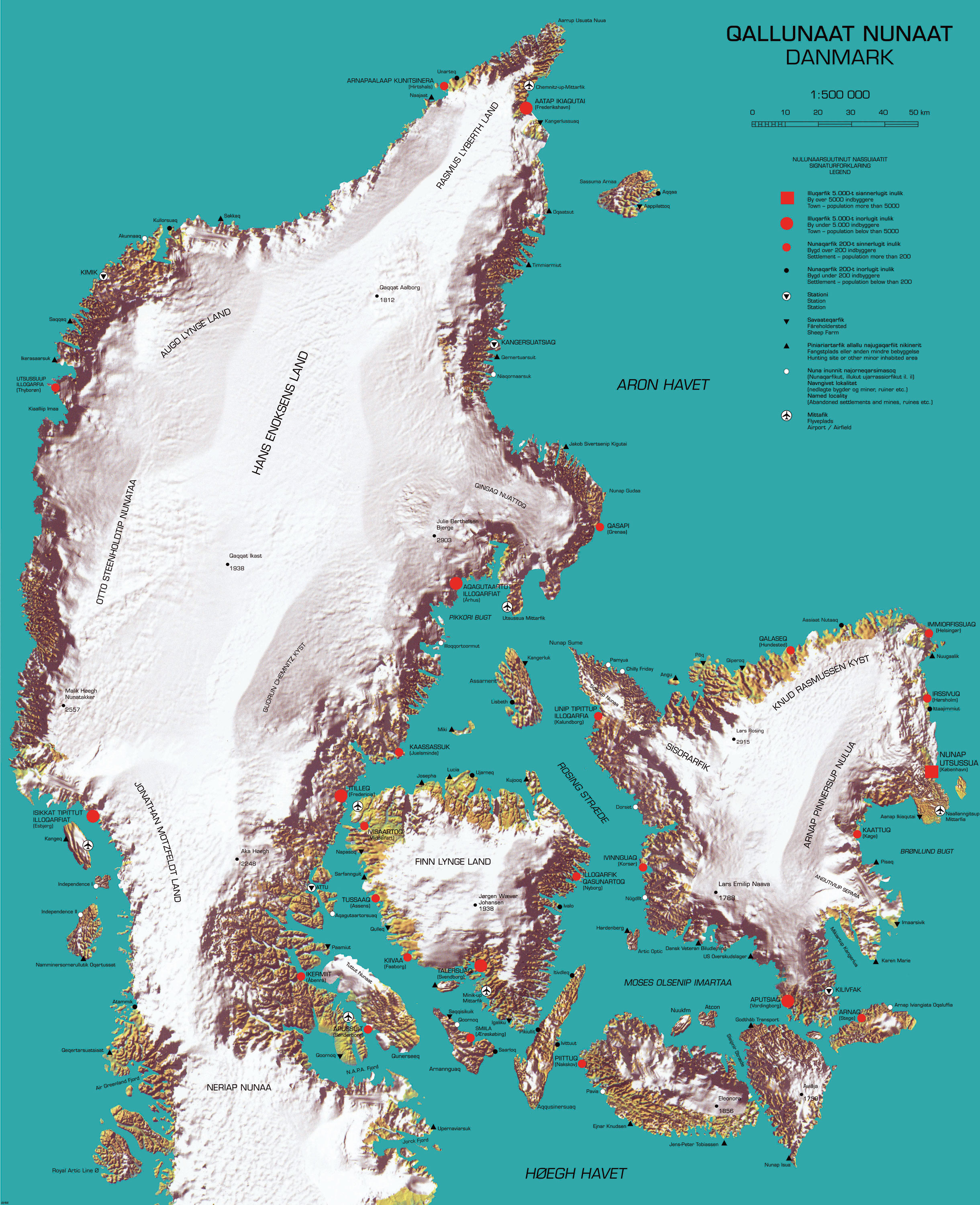
Map of the Week - Reverse Colonialism

Here is a "cool" map that recently appeared on Strange Maps. It was produced by cinematographer and multimedia artist Inuk Silis Høegh for a project called "Melting Barricades," part of the  Rethinking Nordic Colonialism exhibit. The map pictures Denmark being colonized by Greenland, not just by the people but also by climate and topography.


Greenlandic names are imposed on places with the native Danish names in parentheses. The country name and title of the map is Qallunaat Nunaat (Danmark) and its largest city is Nunap Utsussua (København.) The coastline has become jagged from glacial erosion and the frozen interior named after native Greenlanders. The author also appears to have named a strait after himself, the Høegh Havet. 

There are a lot of details that escape me because I don't speak either of the languages and don't know my Illuqarfiks from my Nunaqarfiks. Some understandable (to English speakers) place names include "Chilly Friday" and "Air Greenland Fjord." 


Høegh also made a video called Attack-atigiit showing the Greenlandic occupation of Denmark. The language barrier prevents me from all the clever details but the general picture is clear. Below are some stills. The first one shows quizzical Danes studying the above map. At least I think that's the idea.


In this one Greenland is shown on a world map as a Mercator Giant, planting its flags around the world.


Thursday, January 13, 2011

Another Good BBC Map

In addition to the nice Sudan maps (previous post), BBC also has an excellent map of Brisbane, Australia showing the extent of the floods and major points of interest. Note that the yellow area is flooded area at the predicted water height and the flood appears to have peaked at slightly below that level.

Wednesday, December 9, 2009

Map of the Week- Global Warming

It's snowing here in the northeastern USA so clearly global warming is a hoax! While climate change skeptics and their corporate sponsors continue to bury their heads in the sand, real scientists are gathered in Copenhagen for the United Nations Framework Convention on Climate Change. One of the primary goals is to try and limit the rise in temperatures. Britain's Met Office warned of a possible 4 degree Celsius rise in temperatures by 2060 in a study produced for the Department of Energy and Climate Change. The British government has produced an interactive map showing the impact of a 4C rise in global temperatures.


The circles represent hotspots for the categories listed at the bottom and can be turned on and off as well as clicked for more info.


Down at the bottom is a "credits" tab if you wish to investigate the data sources more closely.

Thursday, September 24, 2009

Map of the Week-Dust in the Wind

So Australia has this big dust storm that turns the sky orange, snarls traffic and causes health hazards and all I can think about is whether or not I can get a good map out of it. Truth is there are few maps to be had. The news sites are more interested in these remarkable pictures.


Seems to me that a map showing the extent of the storm, the damage, traffic tie-ups, anything would be very interesting but no such luck. After spending way too much time searching I finally turned to the trusty old BBC and found some decent maps.


This map shows extent of the storm as well as it's presumed origins at Lake Eyre Basin, a "dusty" area of desert in South Australia.


Most of the satellite images I've seen do not have places labeled, making it difficult to understand the scale of what you're looking at. The above image could be a couple of miles or several hundred miles. Thankfully the BBC came through again and put labels at Sydney and Brisbane, as well as a scale bar. Yes, we're seeing over a thousand miles of dust!

Thursday, August 13, 2009

Map of the Week-Hurricane Season Again

Hurricane season is upon us again. According to a Penn State study (reported by the BBC), Atlantic hurricanes are more frequent than at any point in the last 1000 years. At the moment the Atlantic is fairly quiet. There is a tropical depression named "Two" that is losing strength - details from the National Hurricane Center.


Maps from the National Climatic Data Center show where hurricanes have struck land in the Eastern United States since 1950. Unfortunately the resolution on this image is fairly low and the higher resolution version is 40 MB and will likely take your computer an hour or more to download - perhaps they want you to buy the poster?

Wednesday, June 17, 2009

Today's Weather Forecast-Sunny in the Deserts, Rainy in the Rainforests

I was looking something up on CNN when I came across these weather maps. What's remarkable (or not) is how well they seem to conform to the climate zone patterns of the world. I poorly stitched together the southern hemisphere continents minus Australia (too hard to deal with the scale difference there). I had to rotate Asia for projection issues. Anyway here's a comparison.


CNN's weather forecast for the southern hemisphere.

World Precipitation from Encarta.

Friday, January 30, 2009

Map of the Week - World Climate Zones

Having just spent some time in a (thankfully) different climate zone, I've been interested in world climate zone maps. In geography class we all studied the Koppen Climate Classification. This map is fairly well done and has a nice legend that explains the complicated classifications well. Unfortunately you can't zoom in to see exactly what's happening in your favorite vacation spot.

Scribd has a map that's nice and easy to zoom and pan. Unfortunately they do not translate the legend and I forgot my zone codes.


If you like your climate maps nice and simple you can always try this one. A bit crude but good for the general concept.

Thursday, January 31, 2008

Map of the Week 110 - Sea Change

Promotional materials for the upcoming 12th edition of the Times Comprehensive Atlas of the World include these maps of the Aral Sea. The first one is from the 1967 edition of this atlas.

The second map from the new edition (2007) shows how much the sea has shrunk since then due to water extraction and climate change. The Russian government diverted the main rivers that feed it (the Amu Darya and Syr Darya) for irrigation. Now Kazakhstan and Uzbekistan have inherited a salty, polluted mess. But there may be oil and gas underneath so all's not lost.

Oh and you're supposed to admire the nice Bartholomew cartography too!

Thursday, November 29, 2007

Map of the Week #101 - Australian Drought Maps

Those of you who are regular readers of the Australian Crop and Livestock Report (my brother is one at least) published by the Australian Bureau of Agricultural and Resource Economics know that they have had a horrible drought over the last couple of years. While they have had some rain in November, the map on the left shows how dry things have been this Spring (yes it's Spring there and toilets flush the other way). The map on the right shows the effect on the wheat crop. You will probably want to click on them to be able to read anything.